To do
Development charts in key places visually showing your development
What is Structure?
Structure is defined as the arrangement of and relations between the parts or elements of something complex. Structure can link to many different themes as it is mainly the focus on how something is built however it is usually linked to buildings and how they're built. The theme structure can also be linked to the structure of society and how people are made or the different structures found in nature.
Pinterest of structure
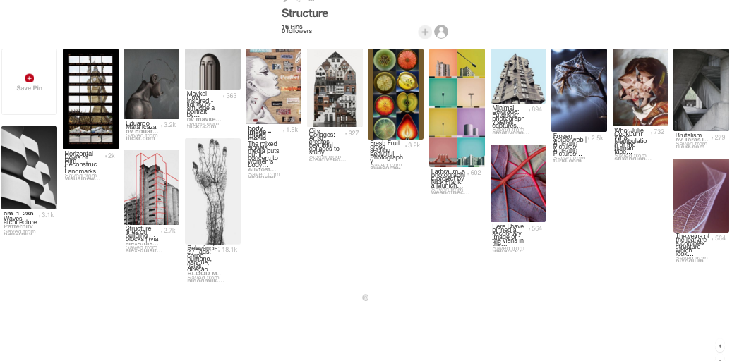
To start thinking of what structure looks like in photography and how different artists have developed the idea of structure, I created a board on pinterest collecting different photos which come under the title of structure.
https://uk.pinterest.com/iglinskyfrenkel/structure/
To start thinking of what structure looks like in photography and how different artists have developed the idea of structure, I created a board on pinterest collecting different photos which come under the title of structure.
https://uk.pinterest.com/iglinskyfrenkel/structure/
Exhibition-The Radical Eye:
The radical eye is an exhibition at the Tate, showing Elton John's collection of modernist photography. The photos are mainly from the 1920's-50's and show a range of artists, some of which whose work has now been shown all together for the first time. An example of this is a group of Man Ray portraits are exhibited together after being brought together by Sir Elton John over the past twenty-five years, including portraits of Matisse, Picasso and Breton.
The radical eye is an exhibition at the Tate, showing Elton John's collection of modernist photography. The photos are mainly from the 1920's-50's and show a range of artists, some of which whose work has now been shown all together for the first time. An example of this is a group of Man Ray portraits are exhibited together after being brought together by Sir Elton John over the past twenty-five years, including portraits of Matisse, Picasso and Breton.
Room 1:
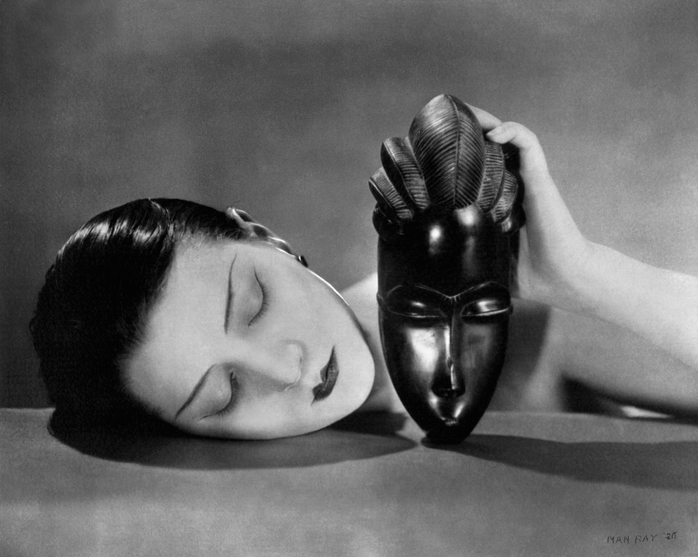
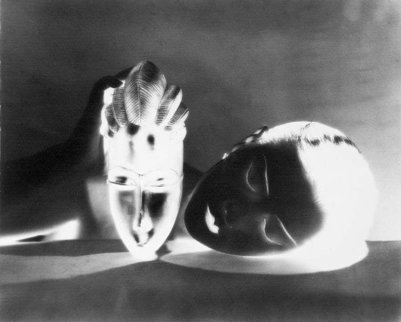
Each room of this exhibition explored a different aspect of photography and had examples of each type of photography. The first room looked at the beginning of modernism which was where artists explored what the camera could do in comparison to what the human eye couldn't do. This room had three images however I think the most effective set of photos were a double set by Man Ray. These were called 'Black and White' and was the same image however one of them was exposed normally and the second one was the negative of this exposure. This manipulation of the image makes the woman's face not the prime focus of the image but rather the mask is. The way the images have been set up shows how symmetrical the two images are as they have been placed side to side so that the line of symmetry is in between the two images. This make it easier for the audience to realise that the negative is the same image as the first exposure.
Each room of this exhibition explored a different aspect of photography and had examples of each type of photography. The first room looked at the beginning of modernism which was where artists explored what the camera could do in comparison to what the human eye couldn't do. This room had three images however I think the most effective set of photos were a double set by Man Ray. These were called 'Black and White' and was the same image however one of them was exposed normally and the second one was the negative of this exposure. This manipulation of the image makes the woman's face not the prime focus of the image but rather the mask is. The way the images have been set up shows how symmetrical the two images are as they have been placed side to side so that the line of symmetry is in between the two images. This make it easier for the audience to realise that the negative is the same image as the first exposure.
|
|
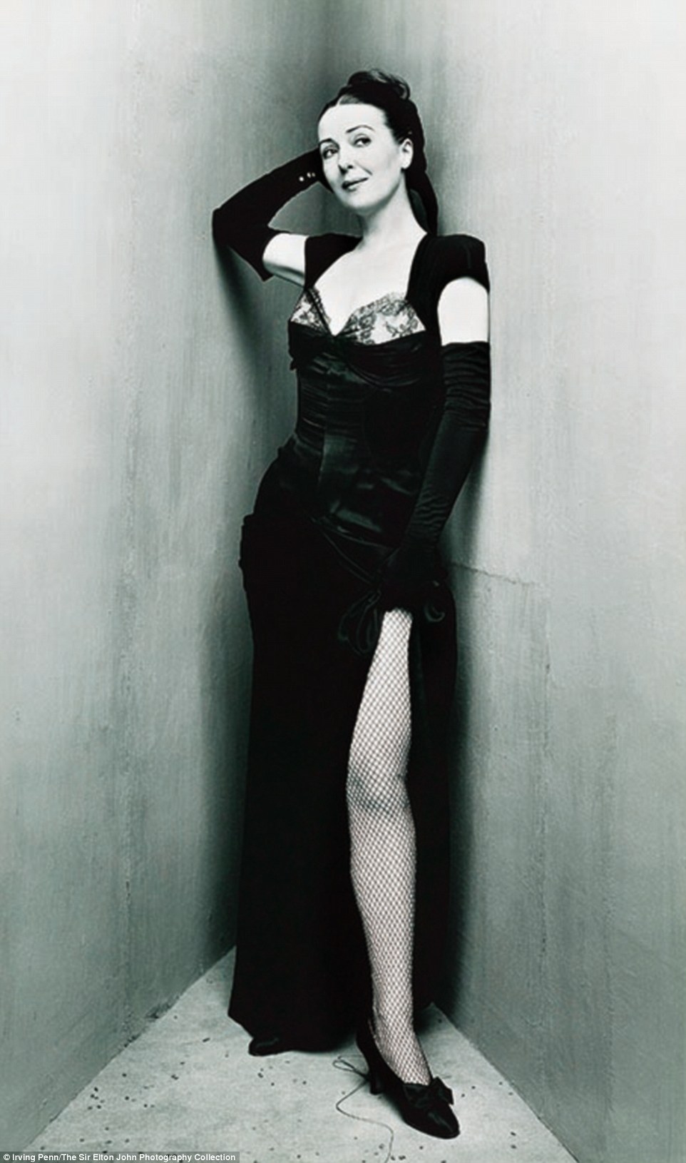
Room 2:
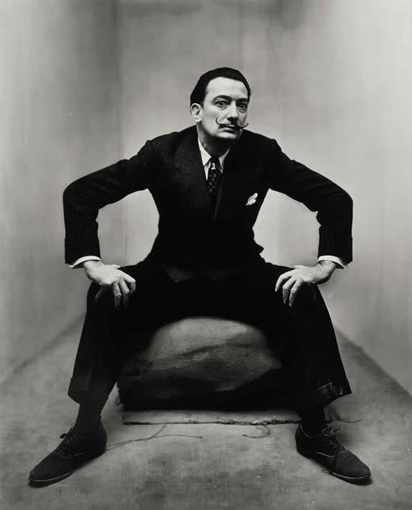
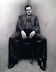
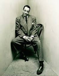
This room also looked at modernism however it looked at how the conventions of the artists remained the same and how they still had a large focus on conventions of portraiture with new ways of thinking about pose, composition and cropping. The main set of photos in this room was a series by Irving Penn where he got several different famous people to stand separately, in different positions in the space. He then looked at how each different person filled the space differently. Most of the different people filled the space in different ways however there was a slight over cross between each person. Dali looked as if he was trying to fill the corner where as Noel Coward looked as if he was squashed in the corner. Both Gyspsy Rose Lee and Spencer Tracy looked very elegant in the space however Gypsy Rose Lee appeared more lean in the space. Joe Louis came across as slumped and as if being in the space didn't bother him which was similar to Duke Ellington's position who seemed very relaxed and casual in this situation.
This room also looked at modernism however it looked at how the conventions of the artists remained the same and how they still had a large focus on conventions of portraiture with new ways of thinking about pose, composition and cropping. The main set of photos in this room was a series by Irving Penn where he got several different famous people to stand separately, in different positions in the space. He then looked at how each different person filled the space differently. Most of the different people filled the space in different ways however there was a slight over cross between each person. Dali looked as if he was trying to fill the corner where as Noel Coward looked as if he was squashed in the corner. Both Gyspsy Rose Lee and Spencer Tracy looked very elegant in the space however Gypsy Rose Lee appeared more lean in the space. Joe Louis came across as slumped and as if being in the space didn't bother him which was similar to Duke Ellington's position who seemed very relaxed and casual in this situation.
|
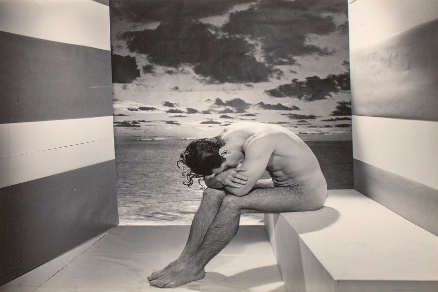
Room 3:
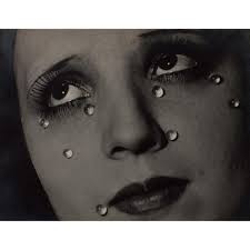
This rooms focus wasn't a period of photography but an area of photography which was portraits and bodies. There were different experimental approaches looking how these could transform the human body into something which is unknown. There were two main image sin this room which we focused on, one by George Platt Lynes and one by Man Ray. The photograph by Lynes is called 'A forgotten model' and shows a model sitting in a room, slumped over. This makes the swimmer seem sad and tired and almost disappointed in himself. The composition of this photograph is quite strange as in the middle of a very blocked room, there's just a window of nature with no window panes or anything. With this composition, our eyes fall first to the mans face and down from his head to his feet and then to notice the big block of nature in the background. The photograph by Man Ray is called 'Glass Tears' and is of a woman looking to the left as if she's thinking about something which has affected her badly. She looks quite bored as if this thought has burdened her for quite a while. The tears on her face are stuck on manually and are stationary. This image is one of Man Ray's most iconic images and was taken during the time when he was splitting up with his partner. This image then shows that Man Ray was sad about his break up but as the tears aren't dropping down the models face it shows its something the artist has become accustomed to. |
|
Room 4:
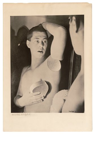
This room explores how earlier techniques of photography which were viewed as mistake scan be manipulated make a creative photo and how double exposure, cutting, marking and recombining photographs can be made into a whole new project. One clear photograph which explores cutting and combing is a photograph by Herbert Bayer which is called 'Humanly Impossible;e'. This image shows a man looking into a mirror and reacting to something he has just found on his body. However, whatever he has found has been covered by a silver circle which has been added to the photo after it was taken. This is a photomontage where gelatin silver print has been used with gouache and an airbrush on paper. This makes the viewer curious as to what the model has discovered on his body and therefore if ever found out, the viewer would ave the same surprise as the model himself experiences.
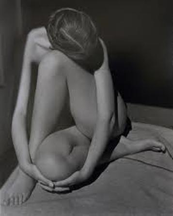
A second image in this exhibition is called 'Nude' and is by Edward Weston. In this image someone is crossed over themselves and therefore has created different sets of shapes with her body such as triangles, circles and different lines. The model in this photo is in the light of the photo where as the background is very shadowy. This draws our attention to the body and makes all parts of the body stand out as the majority of it is in the light.
This room explores how earlier techniques of photography which were viewed as mistake scan be manipulated make a creative photo and how double exposure, cutting, marking and recombining photographs can be made into a whole new project. One clear photograph which explores cutting and combing is a photograph by Herbert Bayer which is called 'Humanly Impossible;e'. This image shows a man looking into a mirror and reacting to something he has just found on his body. However, whatever he has found has been covered by a silver circle which has been added to the photo after it was taken. This is a photomontage where gelatin silver print has been used with gouache and an airbrush on paper. This makes the viewer curious as to what the model has discovered on his body and therefore if ever found out, the viewer would ave the same surprise as the model himself experiences.
A second image in this exhibition is called 'Nude' and is by Edward Weston. In this image someone is crossed over themselves and therefore has created different sets of shapes with her body such as triangles, circles and different lines. The model in this photo is in the light of the photo where as the background is very shadowy. This draws our attention to the body and makes all parts of the body stand out as the majority of it is in the light.
|
|
|
Room 5:
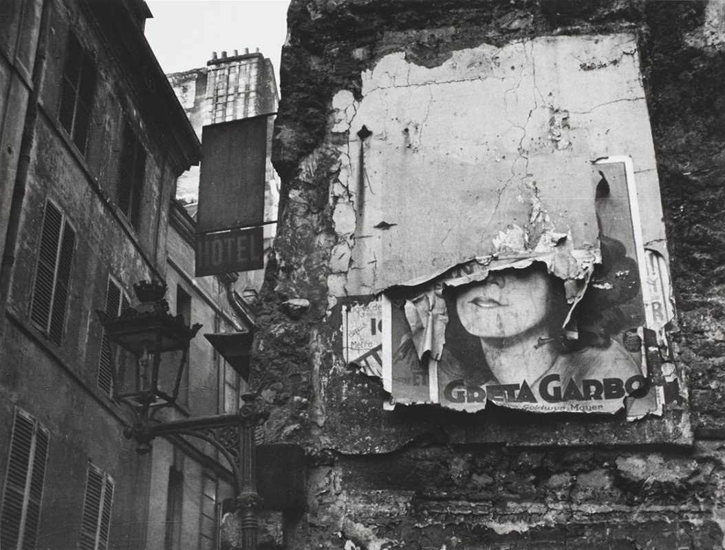
The final room focuses on documents and how during the 1930's, photographers refined the formula for what was viewed as social documentary. One image in this room which really stood out for me was one called 'Greta Garbo poster, Paris' by Isle Bing. This image shows an alley way which was filled with posters however the poster which this image is focused on is falling down. The viewpoint which the artist has focused on is taking the photo from below the poster so that the image is looking up at the poster which shows how people looked up and aspired to be like the posters content. This image reflects how the American Dream was viewed at this time and how the American Dream was unreachable for many as this poster looks almost forgotten. |
|
Room 6:
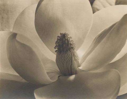
This room focused on the beauty within everyday things which could now be revealed due to the capabilities of the camera. This was things such as unconventional angles and extreme angles which made the objects become strange and sometimes unrecognisable.The first image in this room which I liked is called 'Magnolia Blossom, Tower of Jewels' which is by Imogen Cunningham. This image shows a close up of the middle of a flower with petals surrounding it. This image draws your attention to the smaller petals which have not grown yet which is something you overlook if you just look at a flower from a normal perspective. In this particular flower, there is one petal which looks as if it has 'escaped'.
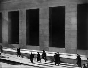
Another image which I liked in this room was an image by Paul Strand which is called 'Wall street, New York'. In this image the photographer is distanced from the pedestrians who are in the image. Because of the artists use of light and shadows, the people appear as silhouettes and seem to merge into the shadows of the buildings however also stand out. This shows how each person is unknown in the big city and how insignificant each person is in the wider world.
This room focused on the beauty within everyday things which could now be revealed due to the capabilities of the camera. This was things such as unconventional angles and extreme angles which made the objects become strange and sometimes unrecognisable.The first image in this room which I liked is called 'Magnolia Blossom, Tower of Jewels' which is by Imogen Cunningham. This image shows a close up of the middle of a flower with petals surrounding it. This image draws your attention to the smaller petals which have not grown yet which is something you overlook if you just look at a flower from a normal perspective. In this particular flower, there is one petal which looks as if it has 'escaped'.
Another image which I liked in this room was an image by Paul Strand which is called 'Wall street, New York'. In this image the photographer is distanced from the pedestrians who are in the image. Because of the artists use of light and shadows, the people appear as silhouettes and seem to merge into the shadows of the buildings however also stand out. This shows how each person is unknown in the big city and how insignificant each person is in the wider world.
|
|
|
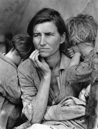
When we visited this exhibition we were asked to focus on specific photos which highlighted different areas of structure however we were also asked to pick some photos which stood out to us as linking to the theme of structure. One of the photographs in the exhibition which I liked the most was the photos by Dorothea Lange which highlighted the depression of 1920's America. The most famous one-Migrant Mother- has been used many times since to exemplify the effects that the depression had on mothers and families. This is because it looks like a photo that has just been taken and therefore is natural. However, in the process of taking this photo, Lange took a series of photos getting close to the other with each photo she took and therefore could be argued that this photo was slightly staged.
Whether this photo was staged or not I believe it's a very effective photo which demonstrates the clear structure of society which was present in 1920's America and which the depression magnified. |
|
|
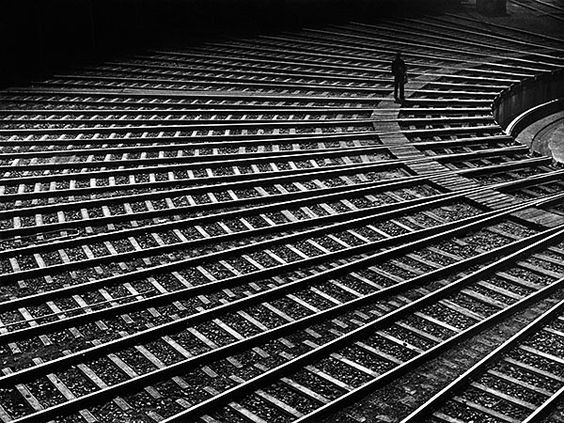
Another interesting image which was in the exhibition was a photograph called 'Rail Spider'. This is by Toni Schneiders and is of lots of different railways all in a circle. Some of these railways are slightly broken while some work and interlink with each other. I thought this highlights the term of 'Structure' as not only does it show the way railways and how they all come together to one point and then split off and take trains to many different places in the country. It also looks similar to a spider web which is why the photo is called 'Rail Spider'. This shows how the structure of an inanimate object can be very easily linked to structure within nature.
|
|
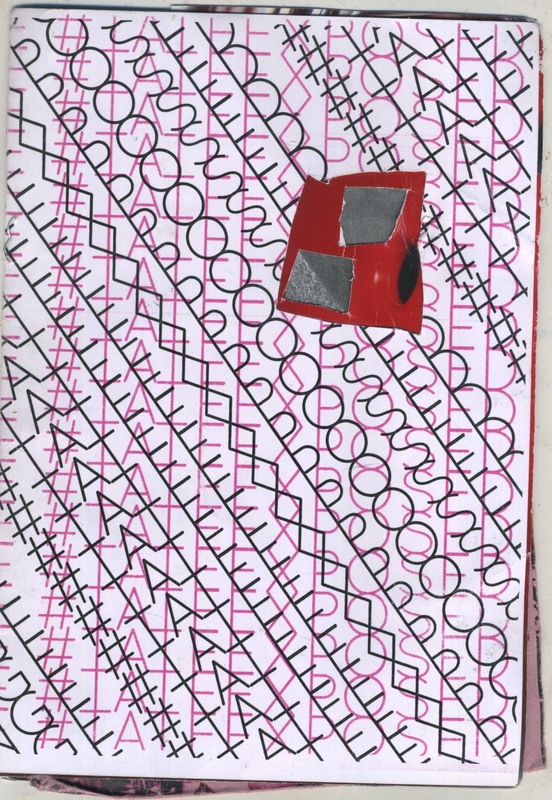
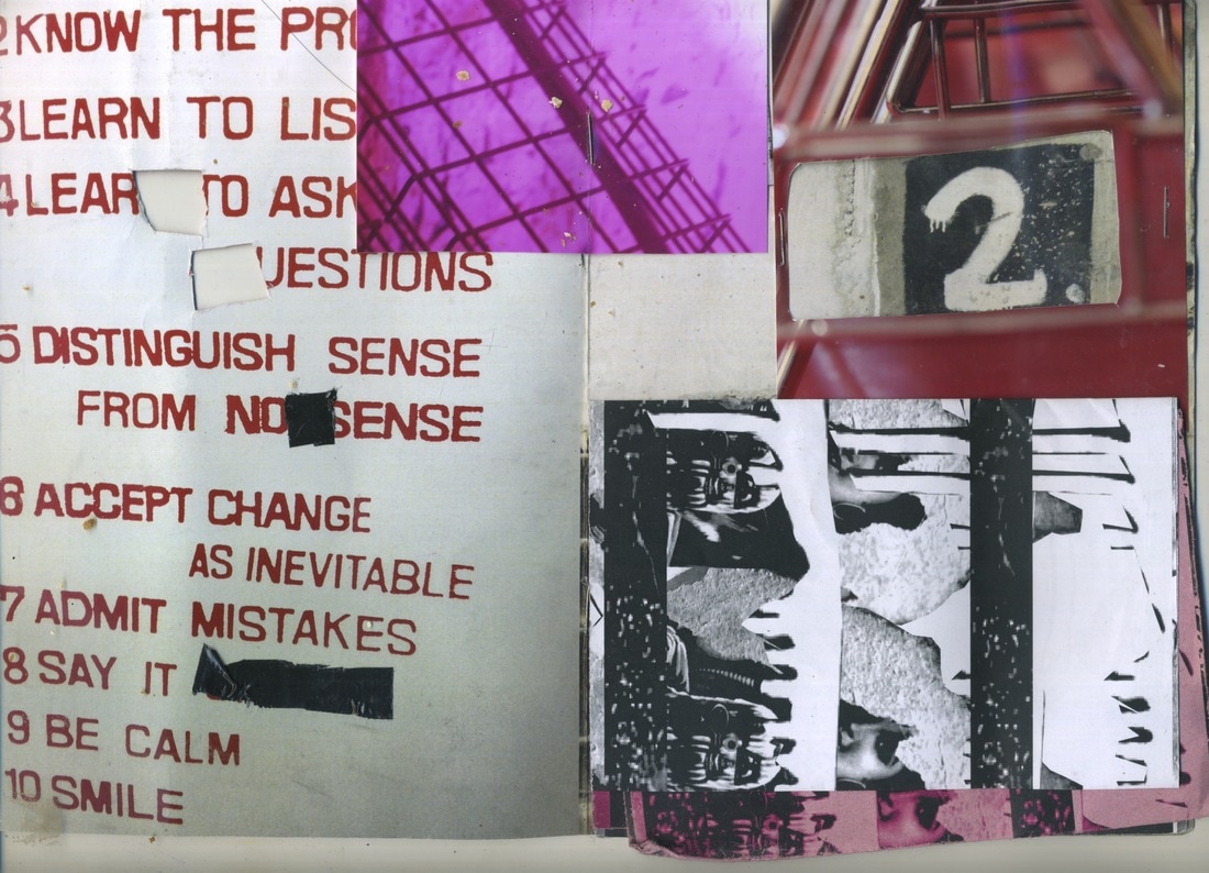
While we are at the Tate there was this workshop which was looking at developing aspects of the photographs in the radical eye exhibition. There were two different tasks which you were able to do in this workshop. The first one was making a booklet by combining different pieces of paper which had different designs on them and different colours. You could also sick on photos onto these paper and cut through the different layers to make the book more interesting. This was an interesting task as it made you think about how you wanted to structure your book and whether juxtaposing to images would be effective or not.
The booklet I made consisted three different layers which all linked to each other in some way. The first layer was just the front of the book however I cut a small section out of it so that you could see small parts of the other layers through it. The second layer is just a red double sheet of paper which links to the front cover which has a pink design and the middle layer which also consists of similar colour schemes. The middle and centre layer has many different layers on top of each other including a page of red writing, a picture of a pink cage and a folded image of someone's face which is repeated and is both in black and white and dark pink. This folded image can unfold to provide more depth to the photo.
The booklet I made consisted three different layers which all linked to each other in some way. The first layer was just the front of the book however I cut a small section out of it so that you could see small parts of the other layers through it. The second layer is just a red double sheet of paper which links to the front cover which has a pink design and the middle layer which also consists of similar colour schemes. The middle and centre layer has many different layers on top of each other including a page of red writing, a picture of a pink cage and a folded image of someone's face which is repeated and is both in black and white and dark pink. This folded image can unfold to provide more depth to the photo.
|
|
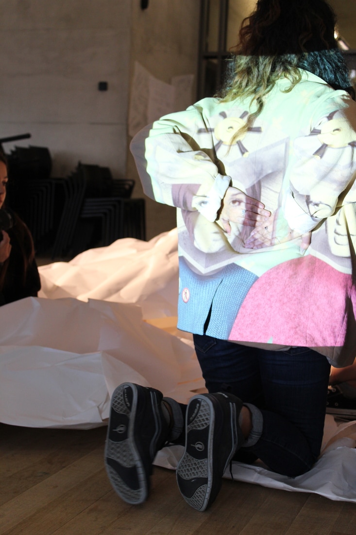
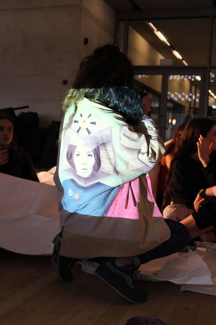
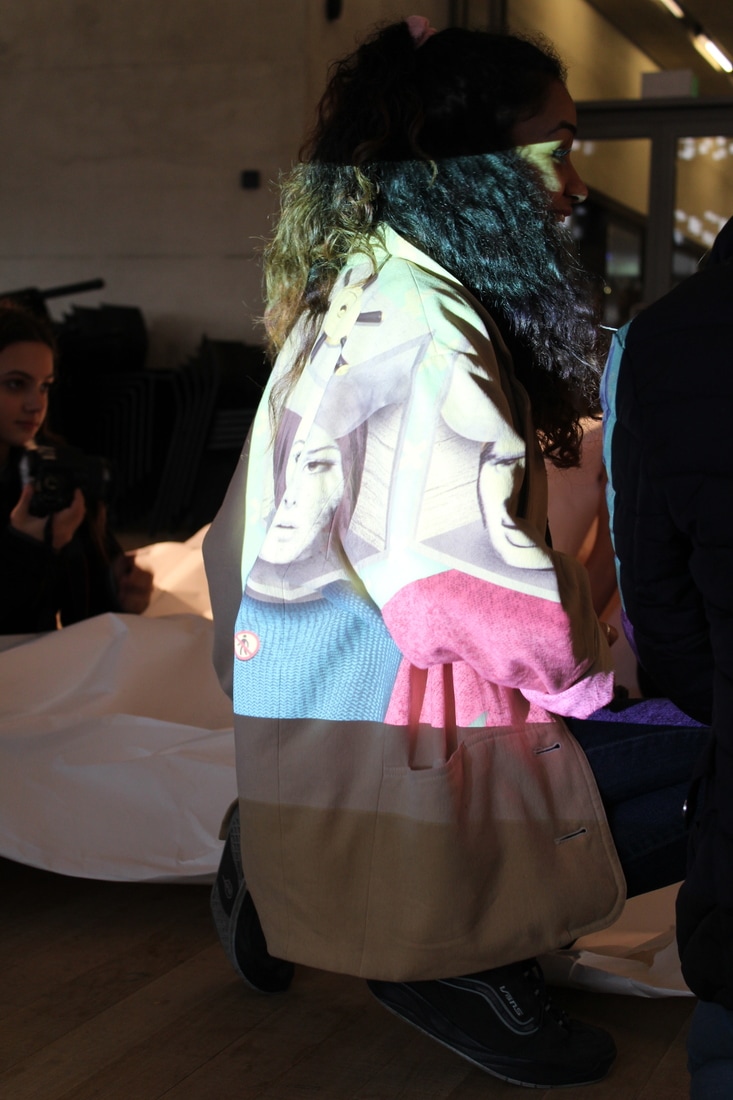
The second task was a development of the series of photos by Irving Penn where he got different celebrities to sit in the corner of a room in different positions to take up different amounts of the space. The way that this was developed was that a massive piece of paper was crumpled and left in the middle room and people were able to sit in it. There was also a projection which meant different colours could be applied to the paper. This task was also interesting as you had to think of interesting ways you wanted to fill the space and in which cases would the projection add or take away from the image.
|
|
|
Structure in Nature
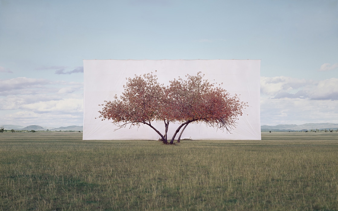
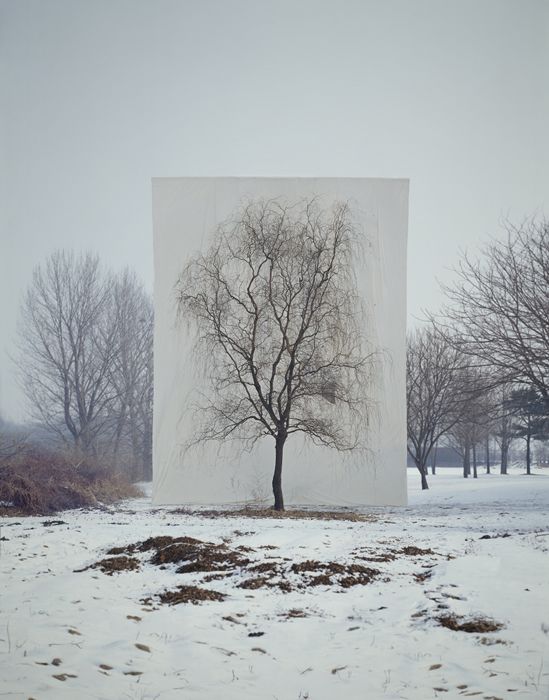
Myoung Ho Lee:
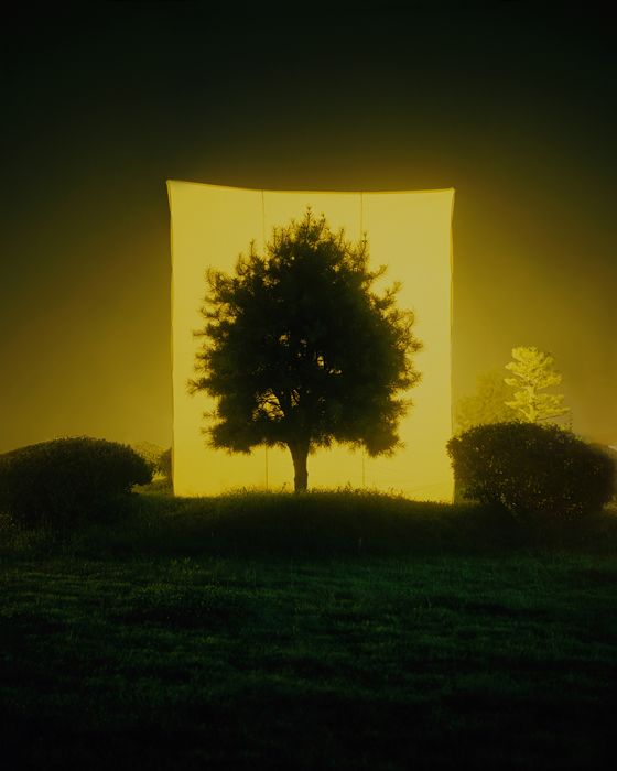
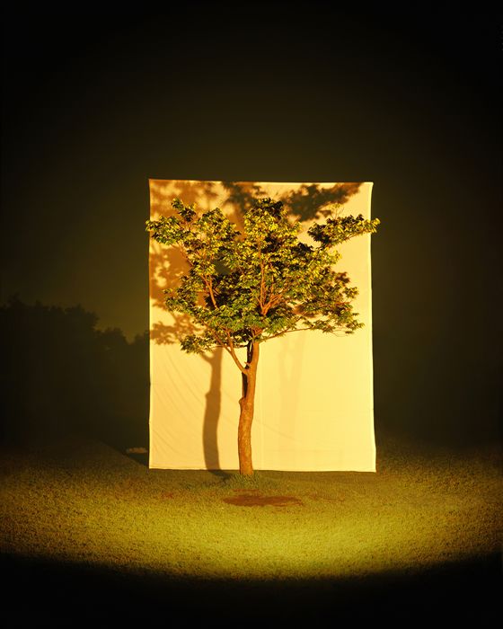
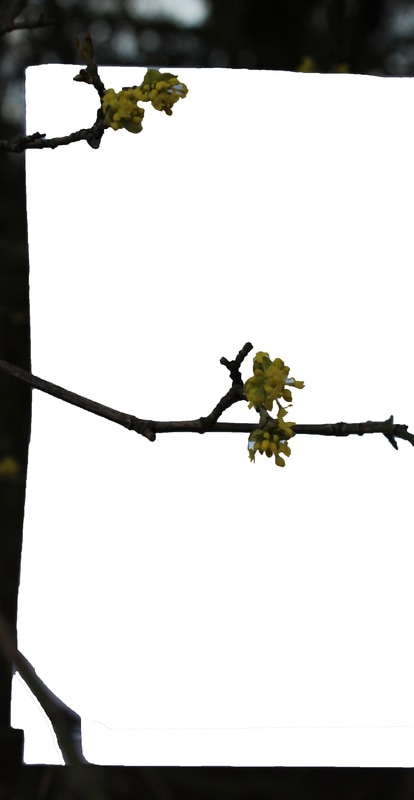
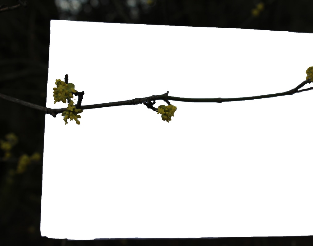
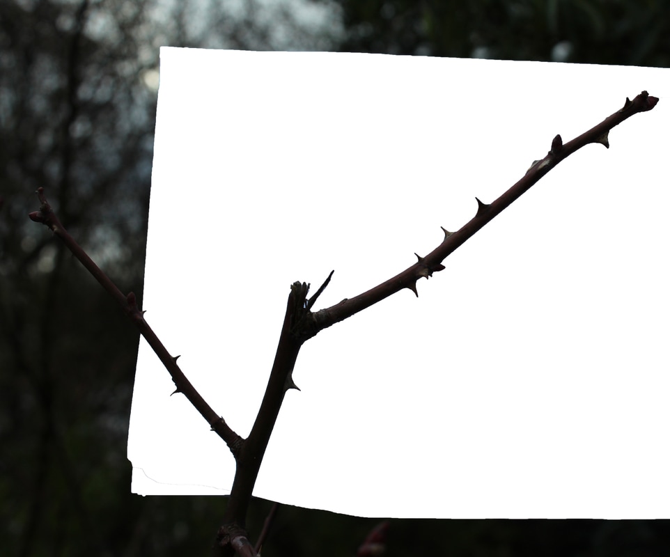
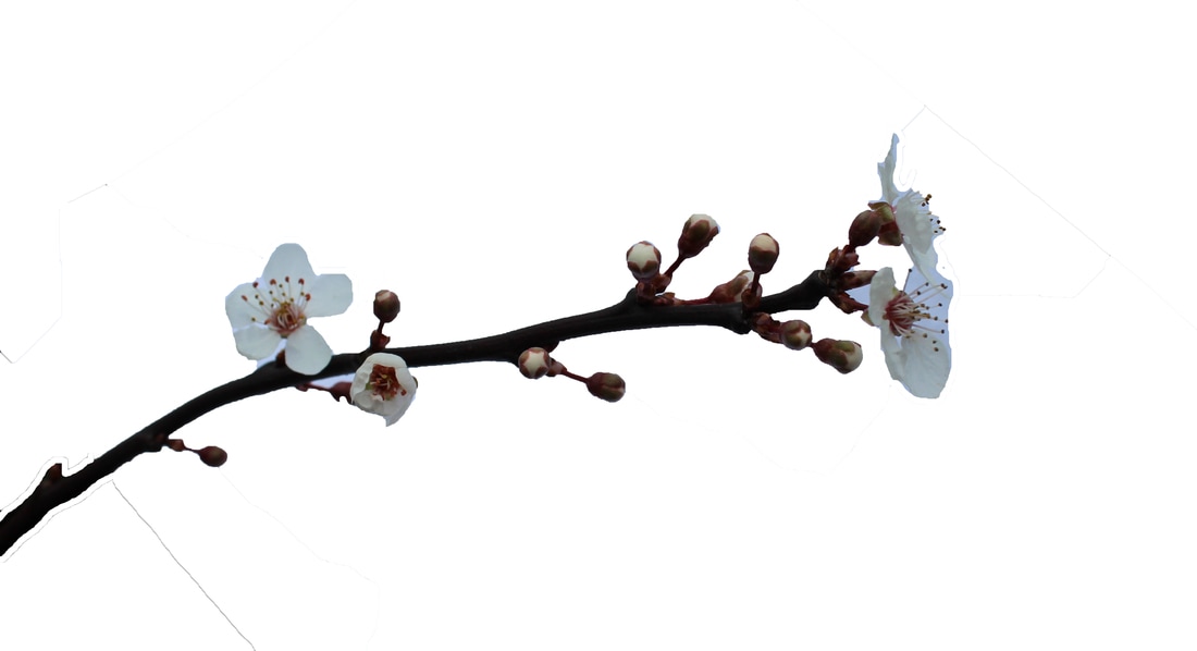
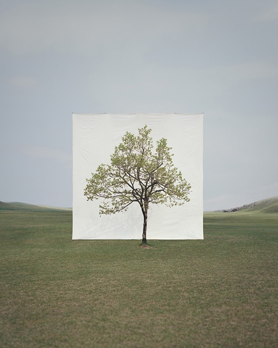
Myoung Ho Lee is a young artist from South Korea who focuses on simplifying complex objects by separating them from their original surroundings. In this set of work, Ho Lee takes photos of nature but isolates the specific piece of nature, usually a tree, from its surroundings. This highlights the structure of the tree itself and draws your eye to it as the background is just a white backdrop. Ho Lee's work usually questions representation, environment, art, reality and seeing. The way that Myoung Ho Lee forms his photos follows four different procedures:
Myoung Ho Lee is a young artist from South Korea who focuses on simplifying complex objects by separating them from their original surroundings. In this set of work, Ho Lee takes photos of nature but isolates the specific piece of nature, usually a tree, from its surroundings. This highlights the structure of the tree itself and draws your eye to it as the background is just a white backdrop. Ho Lee's work usually questions representation, environment, art, reality and seeing. The way that Myoung Ho Lee forms his photos follows four different procedures:
- Selection of The Subject
- Meta-subject, separating the subject
- Photographing
- Confirming the separation
Response to artist- Myoung Ho Lee
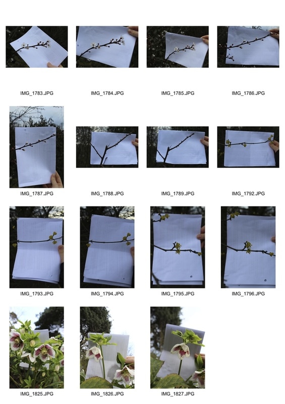
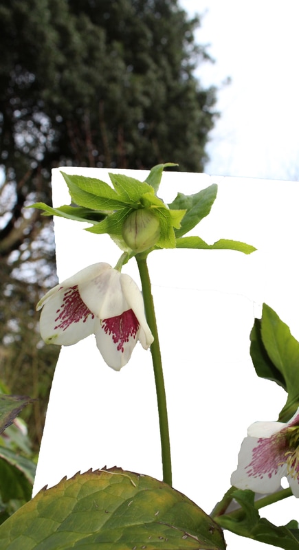
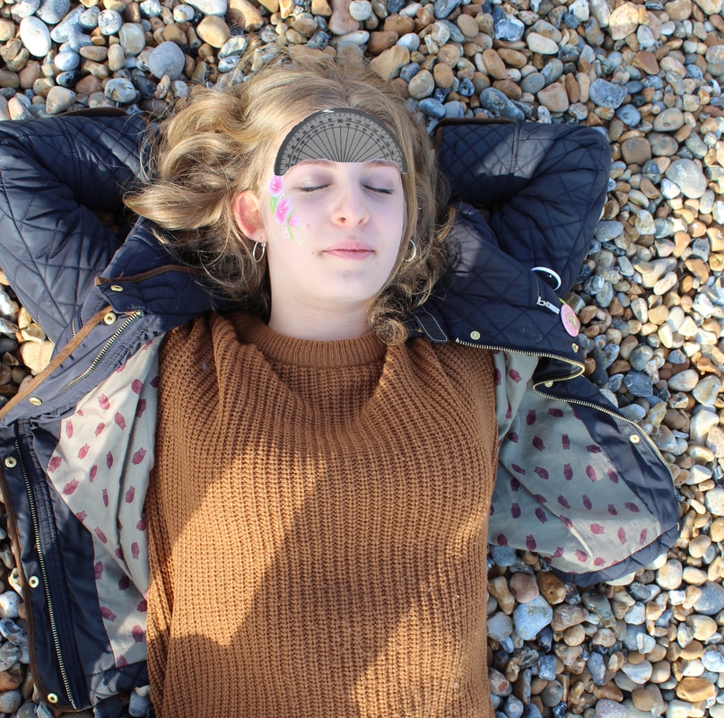
As I can't place a whole white background behind a tree I paced a white piece of paper behind different flowers and branches of different trees. These vary from isolating the plant completely and showing it with the white background and the surroundings. This task was interesting as it really made you look into which part of the plant you wanted to isolate to make the photo significant. However, when thinking about isolating part of the plant and showing the surroundings it made you realise the structure of the plant itself and how each part links to another.
As I can't place a whole white background behind a tree I paced a white piece of paper behind different flowers and branches of different trees. These vary from isolating the plant completely and showing it with the white background and the surroundings. This task was interesting as it really made you look into which part of the plant you wanted to isolate to make the photo significant. However, when thinking about isolating part of the plant and showing the surroundings it made you realise the structure of the plant itself and how each part links to another.
Edits:
Artist and Me:
|

|
On the left you can see an image of the artists and on the right is my own image. One main difference between the two images is that the artists does his project on a much larger scale where as we only did it with flowers rather than trees. Another difference is that the white background for my photographs seem much more artificial and stands out from the nature where as the white background in the photos by the artist is much more natural and fits into the photo more.
Structure of Buildings
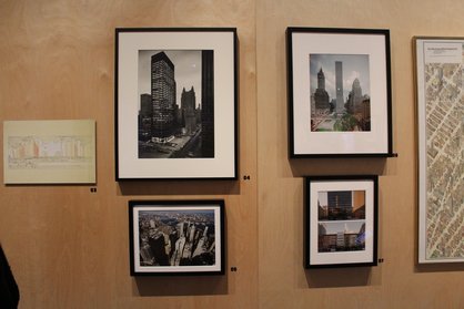
Exhibition- Museum of New York, Mastering the Metropolis; New York and Zoning, 1916-2016
During the half term I went to New York and while there we went to the Museum of New York. Within this museum, one of the exhibitions we looked at was all about the zoning laws in New York. These laws state how high a building is allowed to be built and depending on whether it caves in or how many square feet it takes it, the higher the building can be built.
This was a very interesting exhibition as it showed why certain buildings were built in different ways and explained why the different structures of buildings varied so much.
This was the first display , before you entered the main room. This shows different structures across the city of New York and compared to the buildings and skylines that you see now in the city, these streets look quite empty as you can see the sky in majority of the photos. This was the whole point of the zoning laws as people felt, due to the many skyscrapers, the sky wasn't being seen often enough.
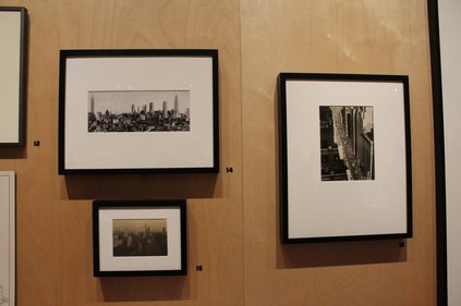
Here are a combination of drawings and photographs on what's allowed with the new 1916 zoning law. In one of the photos, you can see the pyramids of New York's setback skyscrapers which is a result of the new zoning code. These new rules made it uneconomical to build skyscrapers on small lots as building it on a large lot allowed it to rise without a limit. This shows why some buildings in New York are very thin and tall while the shorter ones cover quite a large area.
Secondly, even though the zoning law was created in 1916, due to the depressed state of America, action could only start taking place in the boom of 1920. This mainly had a large effect on midtown New York near Grand Central Station, which grew to be the city's second business district. Because buildings were being built in different areas and therefore where the majority of where people worked was changing, this also lead to people changing where they live. This lead to many new structures being built in new areas and new designs needing to be thought of which people would be able to live in. |
|
Buildings in New York
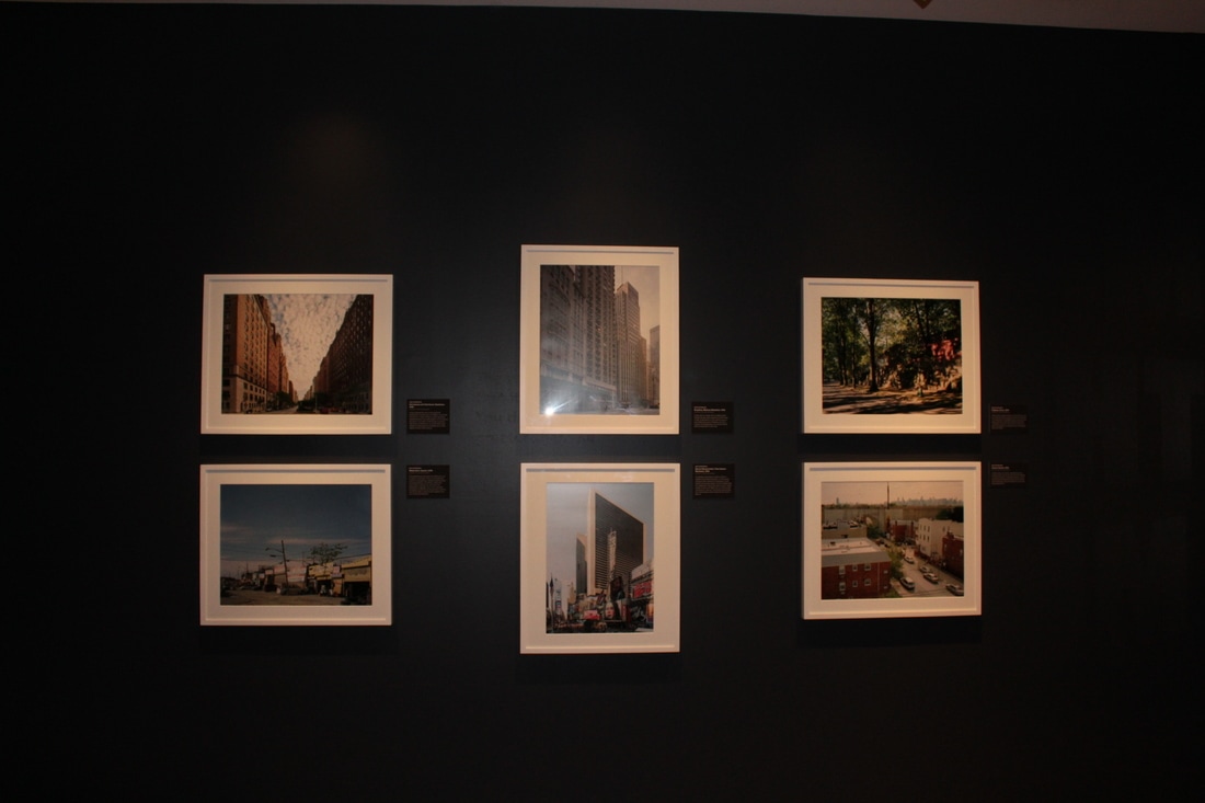
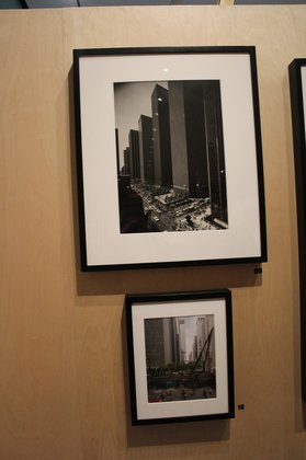
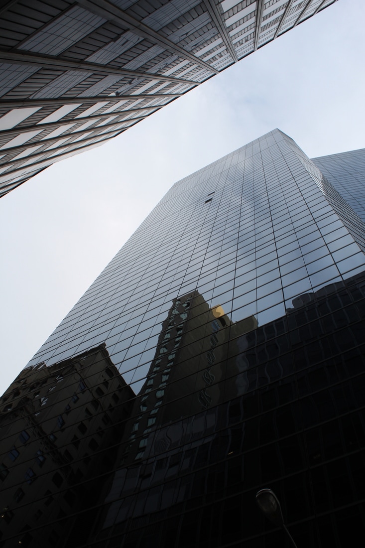
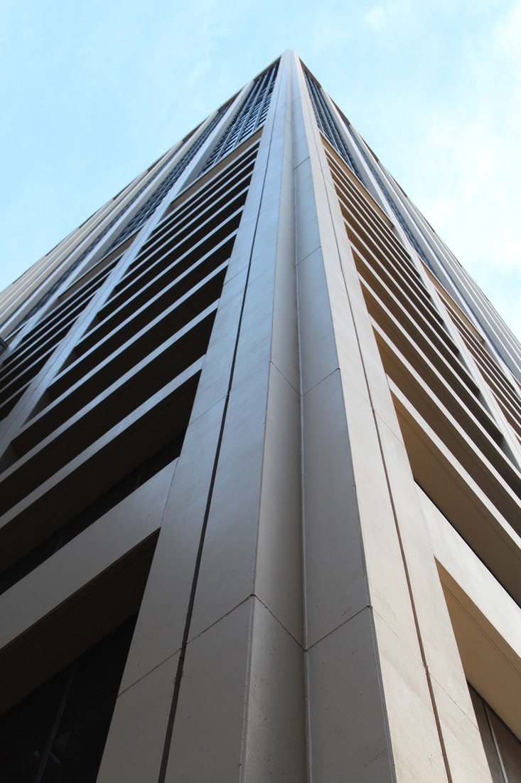
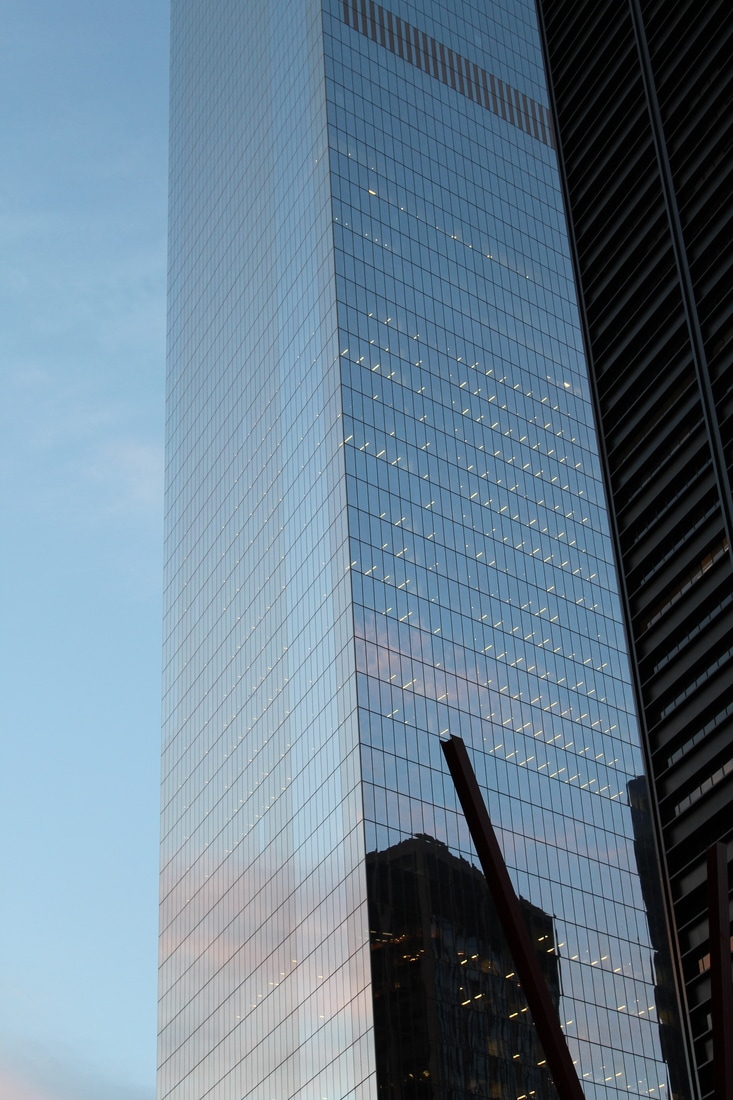
New York is a city known for its many tall and intricate skyscrapers. While there, we stayed in the midst of Manhattan where everywhere I looked there would be some skyscraper or another. This meant there were many opportunities to photograph the different and similar structures amongst the city of New York.
New York is a city known for its many tall and intricate skyscrapers. While there, we stayed in the midst of Manhattan where everywhere I looked there would be some skyscraper or another. This meant there were many opportunities to photograph the different and similar structures amongst the city of New York.
Out of these images I really liked photographing the buildings which reflected their surroundings. This makes it hard to separate what the building is ad what the surroundings are. I also like taking photos of the building from right under it and looking up as I think this is an interesting perspective of the building.
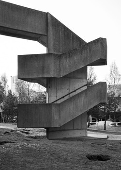
Brutalist Structure
Brutalism is a term for the futurist architecture that was being created by Le Corbusier and ones similar to him. The term was taken from the French phrase "Béton brut" meaning raw concrete. Because of this meaning, Brutalism was created in order to categorise this style of architecture. This architecture is distinguished by the buildings being a large size and by the use of raw unfinished concrete. Most brutalist buildings also use geometric forms to communicate what the building is used for ad what happens in the rooms behind the massive parts of concrete.
Simon Phipps
Simon Phipps is a fine art photographer form the UK ad has taken a series of photographs focused on brutalist buildings. According to Phipps, brutalist architecture communicates functionality, the 'truth to materials' and dynamism. Phipps said the his intent when photographing brutalist buildings is to develop a narrative which looks into the dynaimc, sculptural and conceptual characteristics of the architecture while also paying attention to the context of the movement which was progressive and socially engaged.
Phipps' inspiration comes from someone called Reyner Banham, who wrote an essay on brutalist architecture called "The new Brutalism". In this essay Banham stated that there were three different properties of brutalist structures:
- Formal legibility of plan
- Clear exhibition of structure
- Valuation of materials for their inherent qualities 'as found'
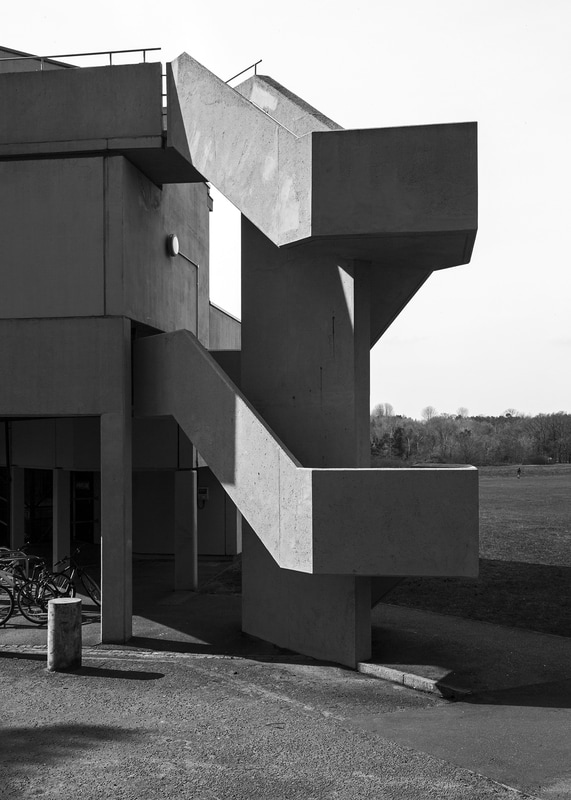
Response to artist-Simon Phippes
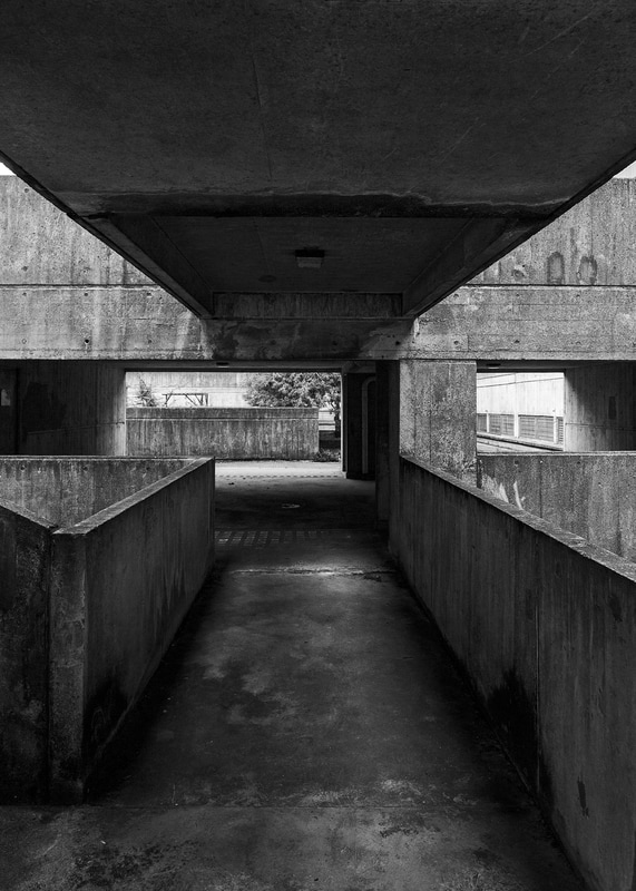
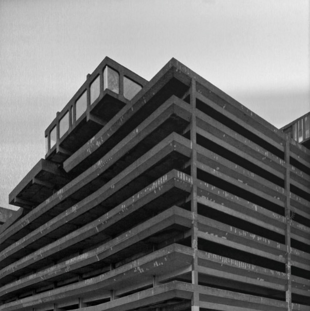
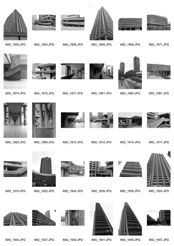
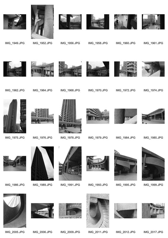
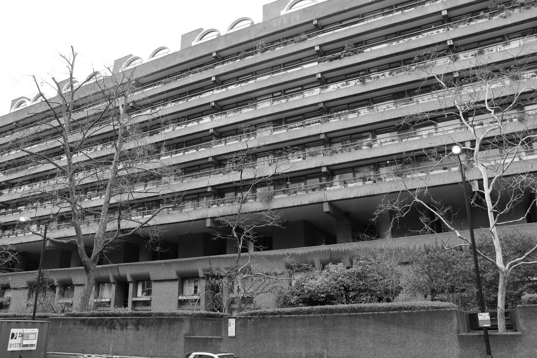
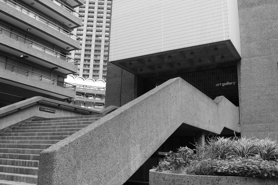
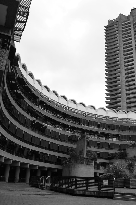
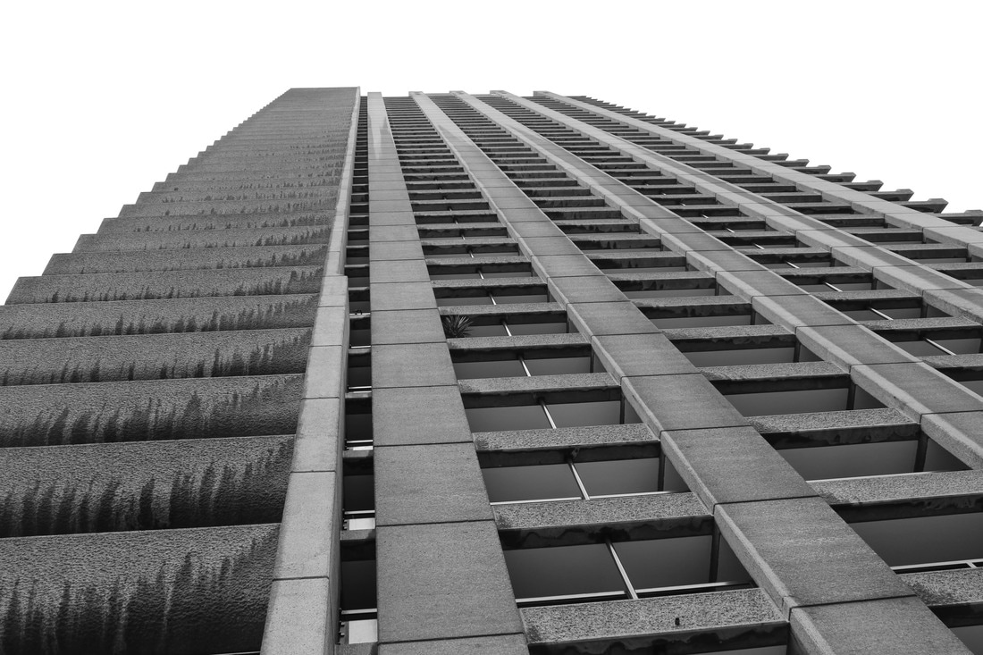
In response to Phipps' work, I went out into London and walked around the Barbican and photographed different brutalist structures. When taking photos of the brutalist structures we were asked to think about three things:
In response to Phipps' work, I went out into London and walked around the Barbican and photographed different brutalist structures. When taking photos of the brutalist structures we were asked to think about three things:
- Negative Space- We had to make sure that the photo was balanced and that the shapes surrounding your focal point were balanced.
- Form/Shape- The buildings could already have been broken into simple shapes but when taking the photos we could try and form new shapes.
- Line and Perspective- We had to consider the angle from which we were taking the photo from. With lines, you could use the lines of the building to draw the audience's attention to a specific point.
|
|
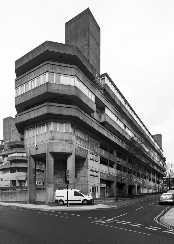
Comparison of Artist and Me:
|
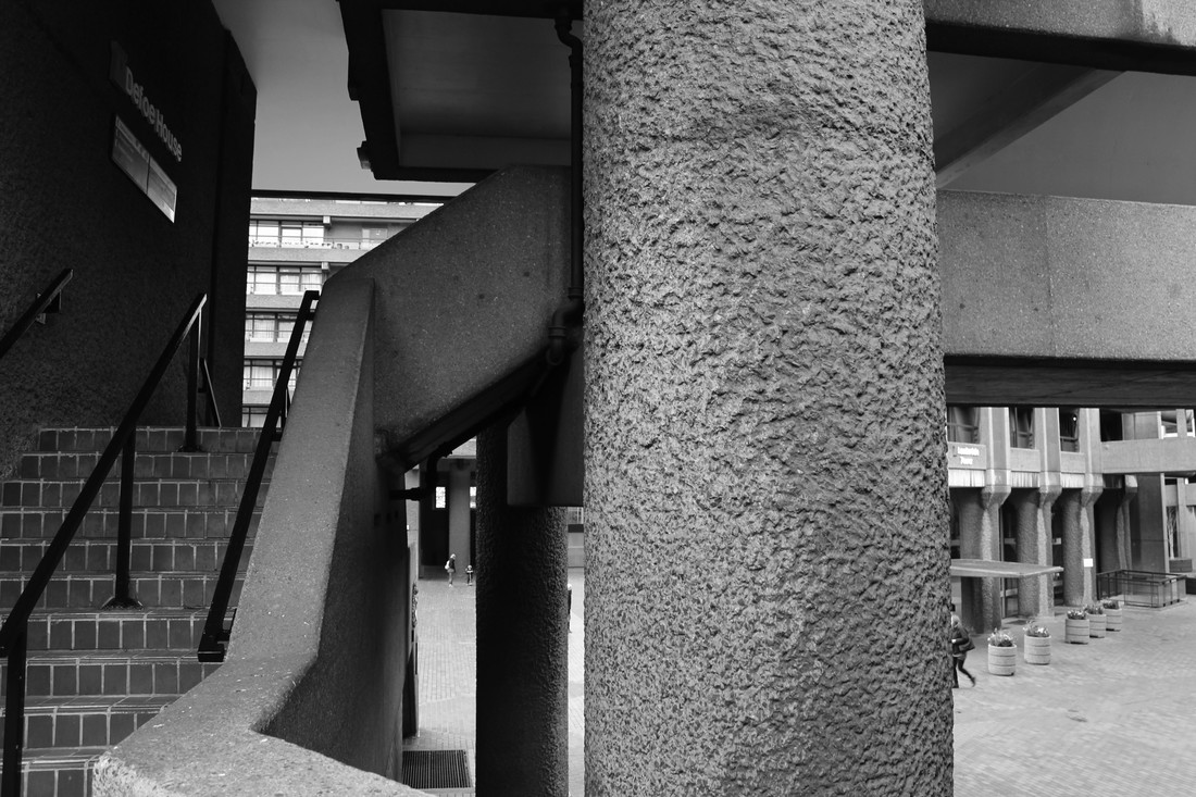
|
The artist focuses on creating different shapes and, especially in this photo, he isolates the brutalist structure from he rest of the landscape. A similarity between my photograph and the artists is that the focus of the photograph is the different shapes created by the structure itself. However, a difference is that the artists is isolated where as my photo comes across as very busy.
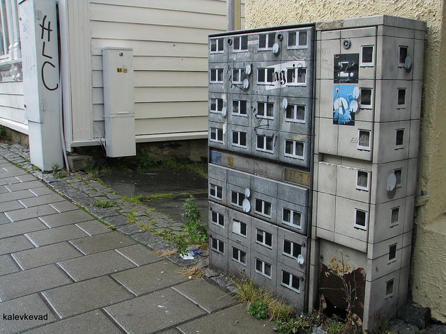
EVOL
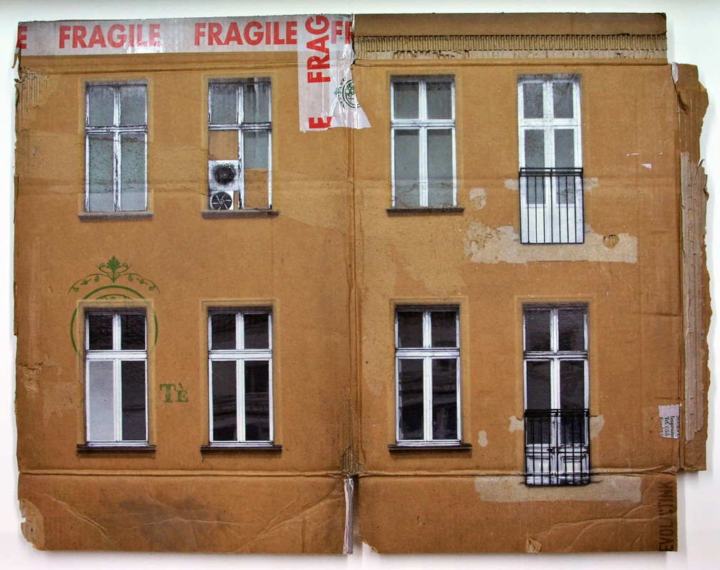
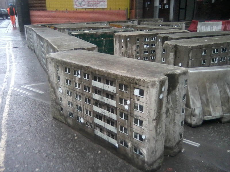
EVOL is a german street artist who creates a city within a city. He does this by transforming urban surfaces into miniature buildings that look very life like. He usually uses complicated stencils and photographs to transform urban surfaces such as power boxes into miniature apartment like buildings. He makes them look very realistic by drawing on balconies an satellite dishes onto the side of the boxes.
He also some times creates a whole miniature city by using boxes all together and creating streets which the audience can walk amongst.
When he doesn't print these images onto urban surfaces he sometimes prints parts of the buildings, such as the windows and balconies, onto a piece of cardboard which usually has already been used.
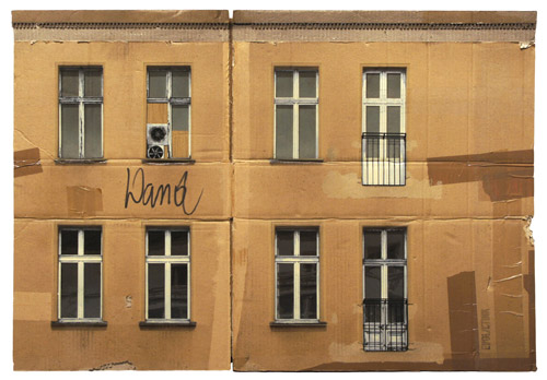
Response to artist-EVOL
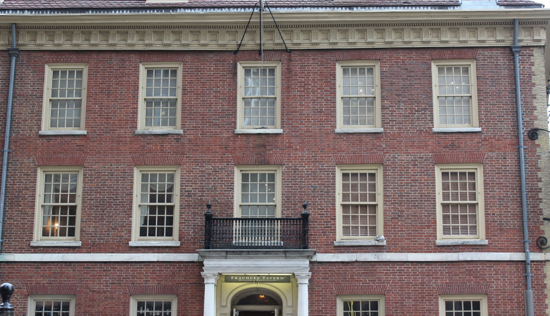
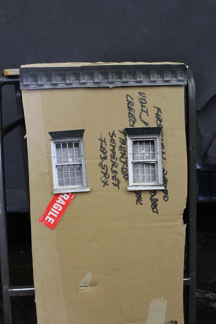
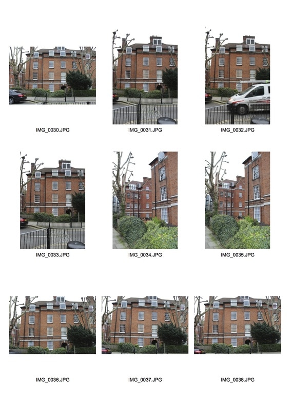
For this project, you need a photo of a building where the photo has been taken standing right in front of the building. This way it can be printed on a flat surface and still look right. The image I used was of an old tavern and included large buildings and a balcony in the middle. For this task I cut out the window frames and stuck them on an extra piece of cardboard and then onto the back cardboard to make it stand out. The cardboard that I used had already been used and had an old address written on it as well as old stickers. This meant that it showed that I was reusing old materials and taking one structure and placing it in a different environment.
For this project, you need a photo of a building where the photo has been taken standing right in front of the building. This way it can be printed on a flat surface and still look right. The image I used was of an old tavern and included large buildings and a balcony in the middle. For this task I cut out the window frames and stuck them on an extra piece of cardboard and then onto the back cardboard to make it stand out. The cardboard that I used had already been used and had an old address written on it as well as old stickers. This meant that it showed that I was reusing old materials and taking one structure and placing it in a different environment.
|
This is the original photo of the building that I then cut out and stuck on cardboard.
|
|
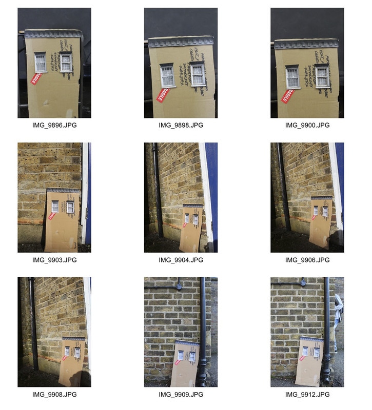
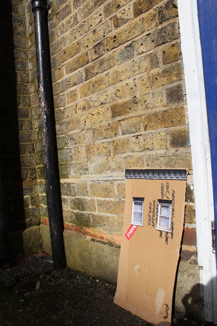
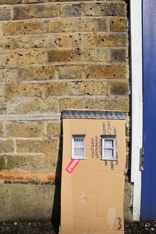
After I constructed my cardboard building, I photographed it in the studio and then also outside, in front of brick walls, from different angles to place the building back into its original environment.
Structure of the Body
The structure of the body is a complex part of a living thing which is anatomical. The structure of the body is mainly unseen to the eye but has many different parts to it such as muscle tissue and bone structure.
Peter Hickley:
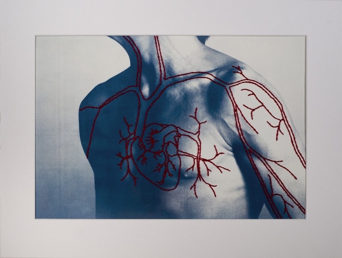
Peter Hickley has produced a series of photos where he photographs portraits of people highlighting different parts of their body. After taking the photos, he stitches on different structures of the body- in some cases this is bone stricture and sometimes its the muscle tendons in a certain part of the body.
Peter Hickley has produced a series of photos where he photographs portraits of people highlighting different parts of their body. After taking the photos, he stitches on different structures of the body- in some cases this is bone stricture and sometimes its the muscle tendons in a certain part of the body.
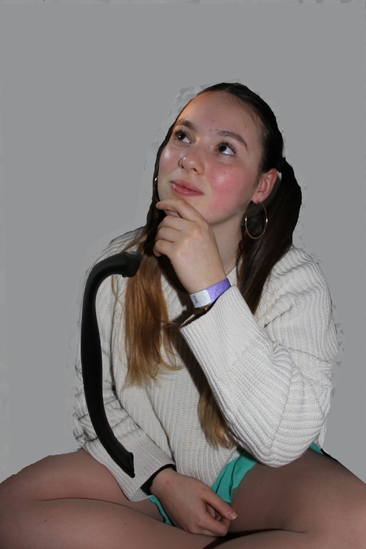
Response to artist-Peter Hickley;
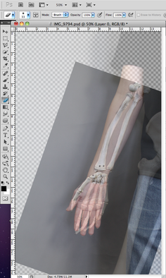
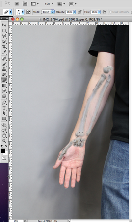
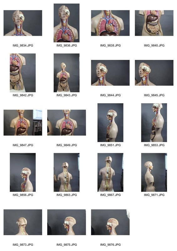
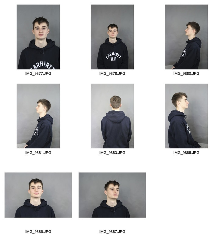
Instead of printing out the photos and sewing onto them, I'm going to take photos of a skeleton and separately take photos of people and combine these photos on photoshop.
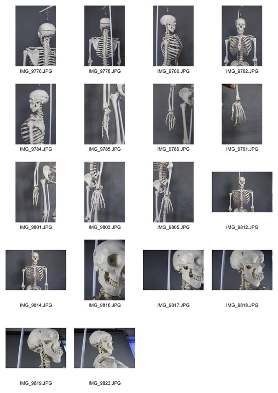
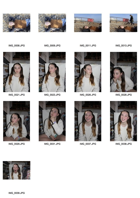
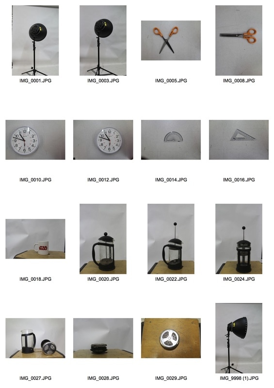
Below are the photos I took in the studio of both the skeleton and the people, before I combined them.
Instead of printing out the photos and sewing onto them, I'm going to take photos of a skeleton and separately take photos of people and combine these photos on photoshop.
Below are the photos I took in the studio of both the skeleton and the people, before I combined them.
|
|
|
Once you have chosen the two photos that you want to combine, there is a series of steps you need to follow:
The hard thing about this task was that we were combining a skeleton which was made out of cast, so could't move much, and a human who can move quite a bit. This means that t was hard to photograph the human in the right position so that they would match the shape of the skeleton. |
|
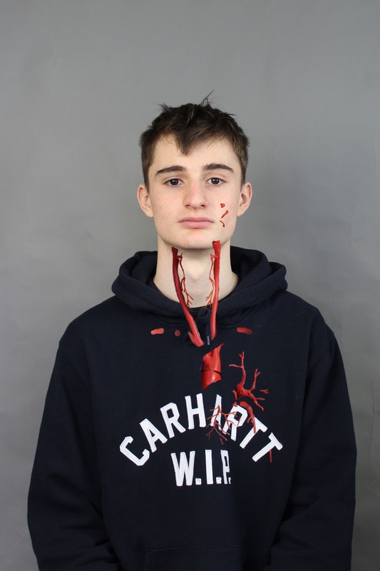
Artist and Me:
On the left is a photo from the artists and on the left is my own image. The difference between these two images is that the body parts which have been imposed onto the portrait in my image look like actual bones where as the artists sews on body parts. I think the actual bones look more realistic however it's harder to fit together the bones and the body.
On the left is a photo from the artists and on the left is my own image. The difference between these two images is that the body parts which have been imposed onto the portrait in my image look like actual bones where as the artists sews on body parts. I think the actual bones look more realistic however it's harder to fit together the bones and the body.
|

|
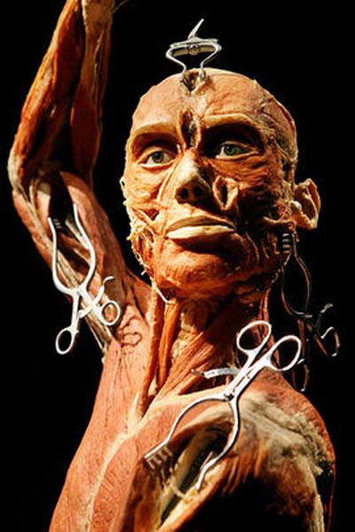
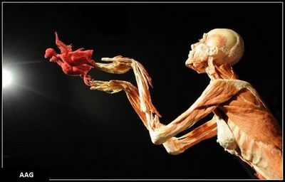
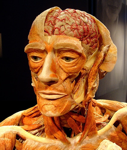
Gunther Von Hagens
Gunther Von Hagens was born in 1945 in Alt Skalden. Von Hagens suffered from a rare bleeding disease which resulted in him nearly dying at age 6 and he had to remain within hospital for many weeks. Within these weeks, Von Hagens made a special bond with the doctors and nurses which inspired to become a physician. After going to medical school, Gunther Von Hagens began to question communism which led to him involving himself in many different revolutions. However this led to him being imprisoned for 2 years in east Germany. After this he continued his medical studies which led to him discovering how the body is preserved in different ways. This ended in him creating sculptures out of dead bodies which people had donated to him which includes his best friends body. In his sculptures, the bodies are positioned in different ways, sometimes giving an almost comical effect.
Gunther Von Hagens was born in 1945 in Alt Skalden. Von Hagens suffered from a rare bleeding disease which resulted in him nearly dying at age 6 and he had to remain within hospital for many weeks. Within these weeks, Von Hagens made a special bond with the doctors and nurses which inspired to become a physician. After going to medical school, Gunther Von Hagens began to question communism which led to him involving himself in many different revolutions. However this led to him being imprisoned for 2 years in east Germany. After this he continued his medical studies which led to him discovering how the body is preserved in different ways. This ended in him creating sculptures out of dead bodies which people had donated to him which includes his best friends body. In his sculptures, the bodies are positioned in different ways, sometimes giving an almost comical effect.
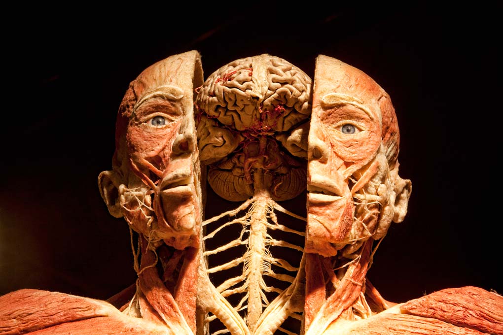
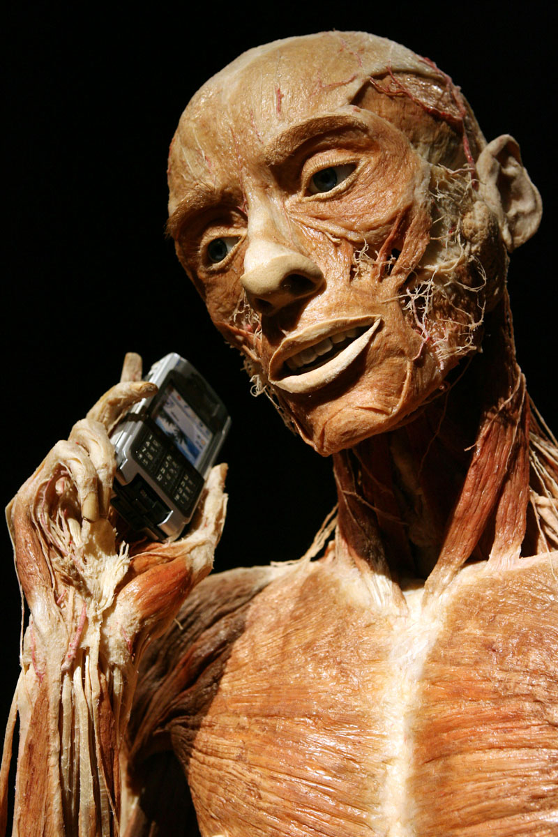
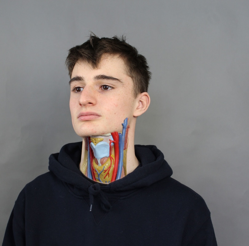
After we combined photos of people and skeletons we took photos of a skeleton however this skeleton has all the muscles and internal organs rather than the bones. By looking at the inside structures of the bodies rather than the bones, this looks quite similar to the project Gunther Von Hagens carried out.
|
|
In these two images I experimented with different muscles and veins to uncover. In one of the photos I only uncovered the models neck muscles which I think worked effectively as he was wearing a hoodie which made the parts of the image where there were no muscles more casual and only where there was bare skin the main focus.
In the other photo I only uncovered the red veins in the body. This was stranger as there were a very little amount of veins compared to the amount of model that you can see. Also, as the model and the skeleton aren't the exact same size this means some of the veins are in the wrong place.
In the other photo I only uncovered the red veins in the body. This was stranger as there were a very little amount of veins compared to the amount of model that you can see. Also, as the model and the skeleton aren't the exact same size this means some of the veins are in the wrong place.
Artist and Me:
On the left is the image of the artists and on the right is my own image. In my image, because not all of the portrait is made up of veins and muscles, it looks more subtle than the artists work. I think only turning a small section of it into veins but having this area all clumped together it is easier to recognise as parts of the body rather than something which has just been put on top of the image.
On the left is the image of the artists and on the right is my own image. In my image, because not all of the portrait is made up of veins and muscles, it looks more subtle than the artists work. I think only turning a small section of it into veins but having this area all clumped together it is easier to recognise as parts of the body rather than something which has just been put on top of the image.
|

|
3 Strands:
Strand 1: Deconstruction
|
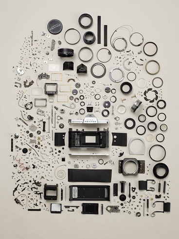
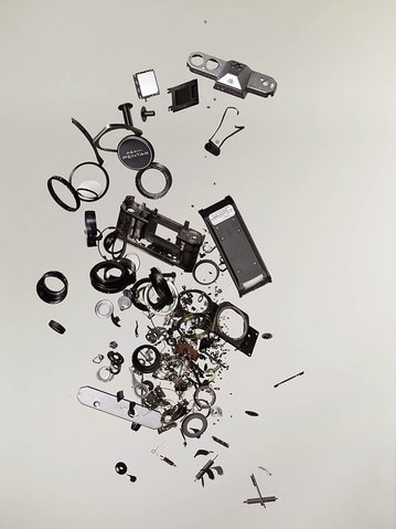
Todd McLellan
Todd McLellan was born in Saskatchewan now resides in Canada and is an artist and a photographer. He has produced a series of photos called "Things Come Apart". This project consists of McLellan taking apart everyday objects, either retro or modern, and lays out all of the components and photographs them. These objects are ones that we usually see everyday but probably pay no attention to. He also takes photos of the objects hanging from mid-air, after they have been taken apart. 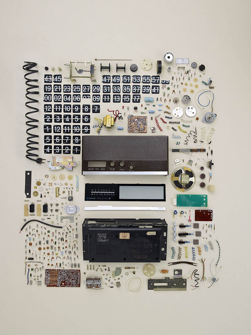
|
|
The first strand I was thinking of doing was deconstruction of objects. This would be completed with objects I found abandoned and would take them apart and then photograph this is the studio. This would exemplify their structure as it would bring awareness to all the small parts which make up the overall object. This is very similar to McLellan's project as he also takes apart objects however, after I have taken apart the objects, placed them in the studio and photographed them I'm going to print the photo and then place the hard copy of the photo back where you'd expect that object to be.
|
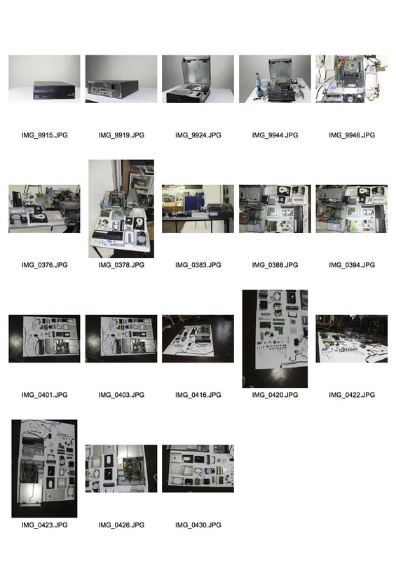
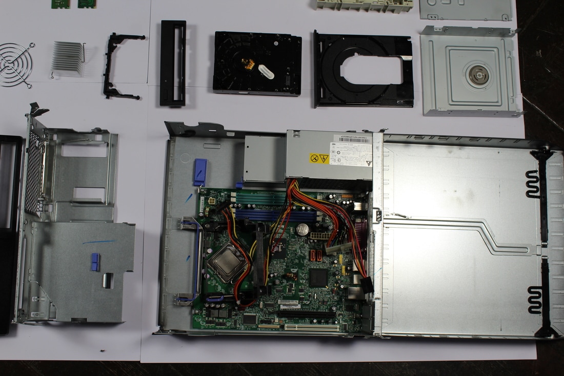
For this project, the object which I took apart was an old computer hardware. I tried to take every piece, that I could, apart so that I could see all the little pieces and little details which make up the hardware. I took photos of the hardware while I was taking it apart so I documented it before I took it apart, during and once all of the pieces were apart but not organised.
I was able to take most of it apart however at the end I had to leave the power box and main motherboard as these were attachable from the metal box. There was also a part of the fan which wouldn't come off as one of the screws was screwed in too tightly. Once all of the pieces had been separated I organised so that the big pieces of the hardware were at the top of image and gradually all of the small bits such as screws were at the bottom. This was quite hard to organise as I had to make sure the different parts of the hardware linked to the objects they were nearby. Also, the screws were very hard to balance so they took a long time to organise. |
|
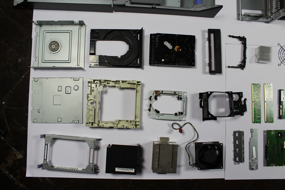
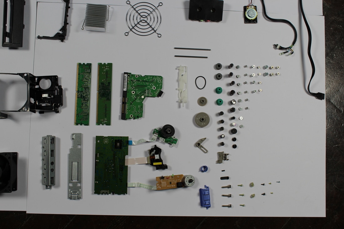
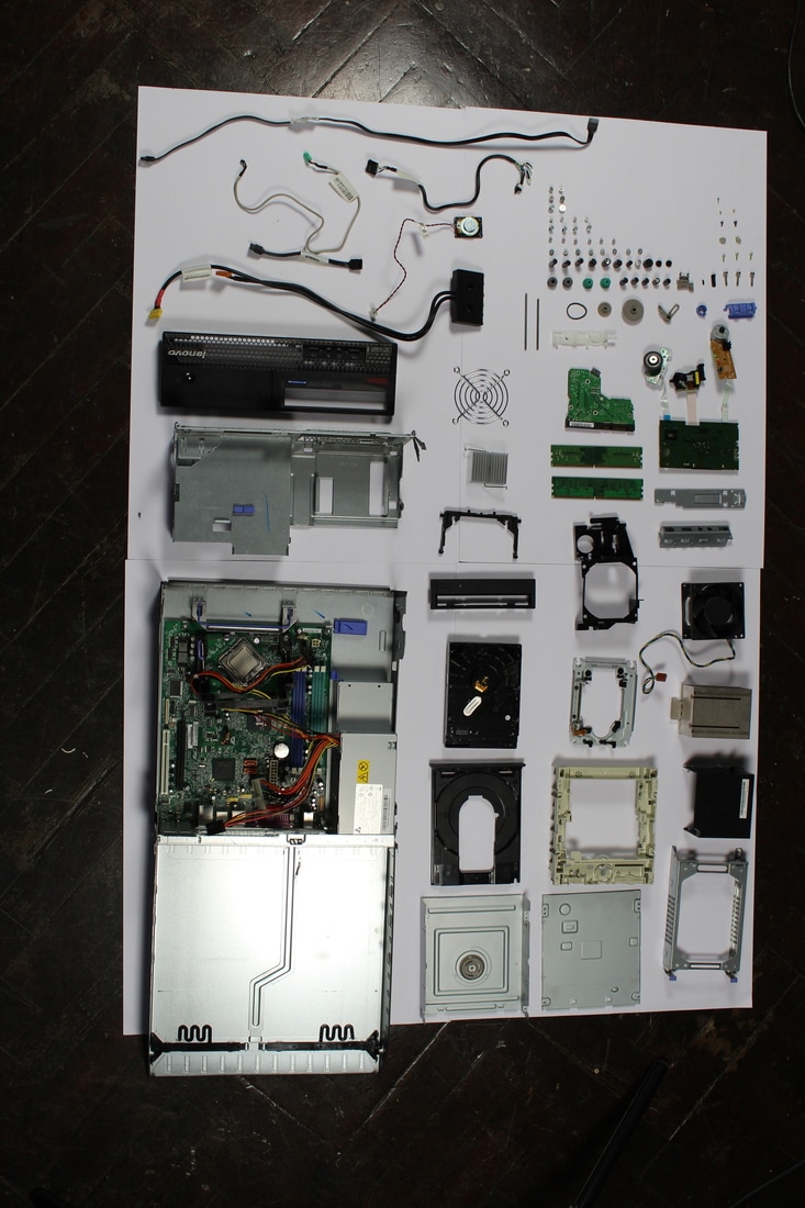
These photos didn't turn out as well as I wanted them to but they were very hard to take photos of. This was mainly because of the lighting-I used two big lights either end of the big white background however this shadowed some areas massively which contrasted weirdly with the ares which were really lighted. Also, as some of the pieces are massive pieces of metal they reflected the light so that you couldn't really see the shape of the piece.
Another issue while photographing was that I wasn't tall enough to photograph the whole thing from a good angle. This meant that the photos seemed o be slightly tilted which didn't give the same effect as when the photos are taken straight on.
Another issue while photographing was that I wasn't tall enough to photograph the whole thing from a good angle. This meant that the photos seemed o be slightly tilted which didn't give the same effect as when the photos are taken straight on.
Strand 2: Social hierachy
|
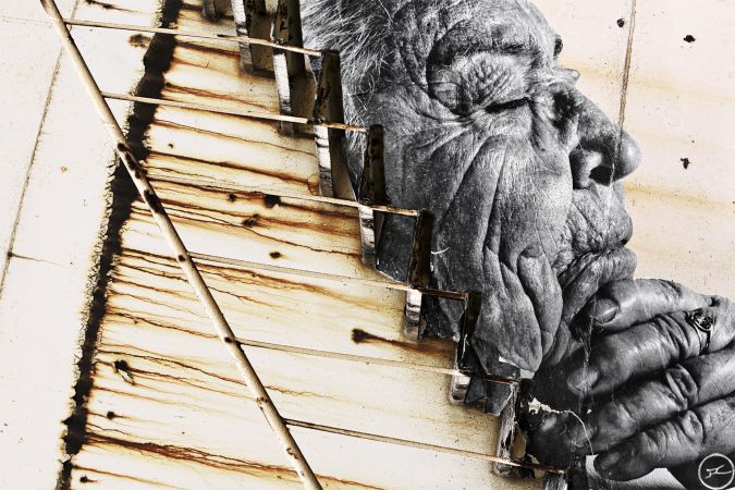
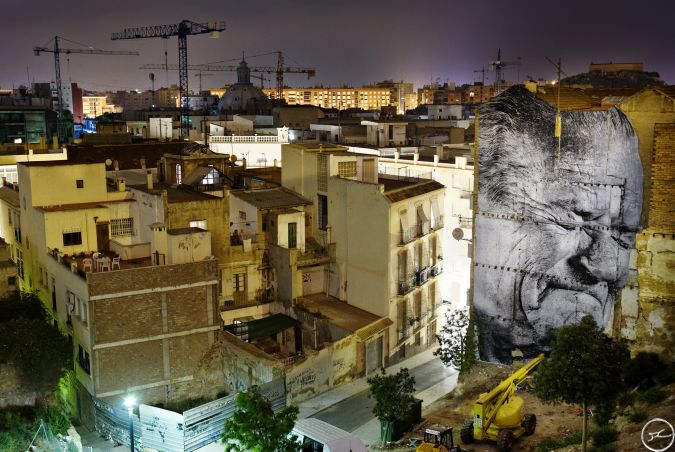
JR
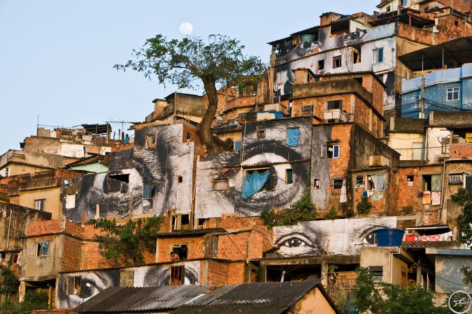
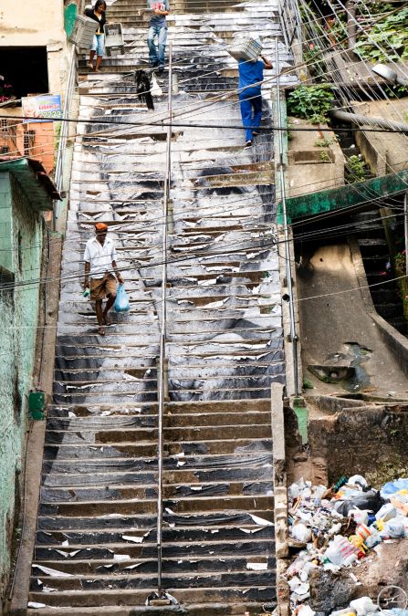
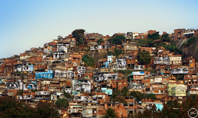
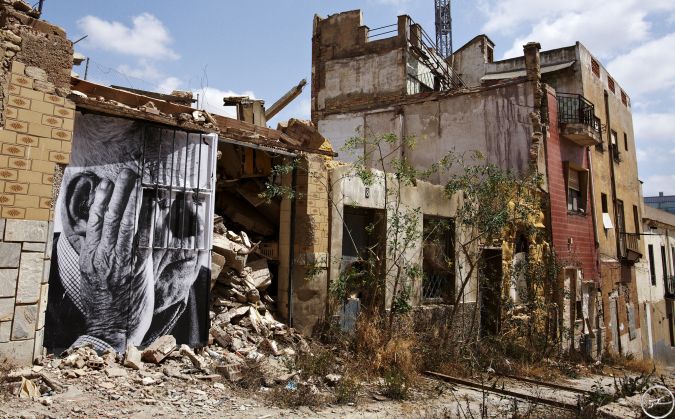
JR started as a photographer after he found a camera in the Metro in Paris in 2001. The way he exhibits his photography is freely in the streets of the world. This catches the attention of people who are not typical museum visitors. JR takes photos and then prints these photographs largely onto different buildings depending on what his project is. For each of his projects he travels around the world and produces the same project in different countries, each project ending differently due to the different buildings in each different country. One project he has recently done is called "Wrinkles of the City" where he photographed elderly people and showed how he neighbourhoods are changing through the wrinkles of these people. Another project he did was called 'Women are Heroes' where he printed lots of different photos of women and printed them on different buildings and vehicles. For this project he didn't just print full portraits, sometimes he printed just the woman's eyes. These are photos from the 'Women are Heroes' project and are taken in Brazil.
|
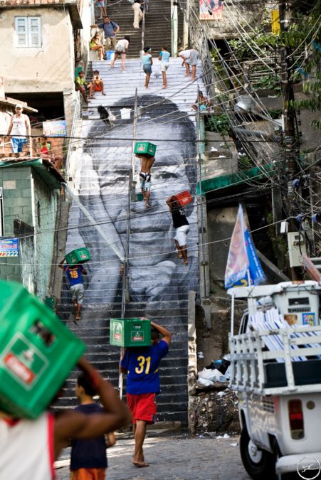
This is the 'Wrinkles of the City' project and was taken in Cartegena
|
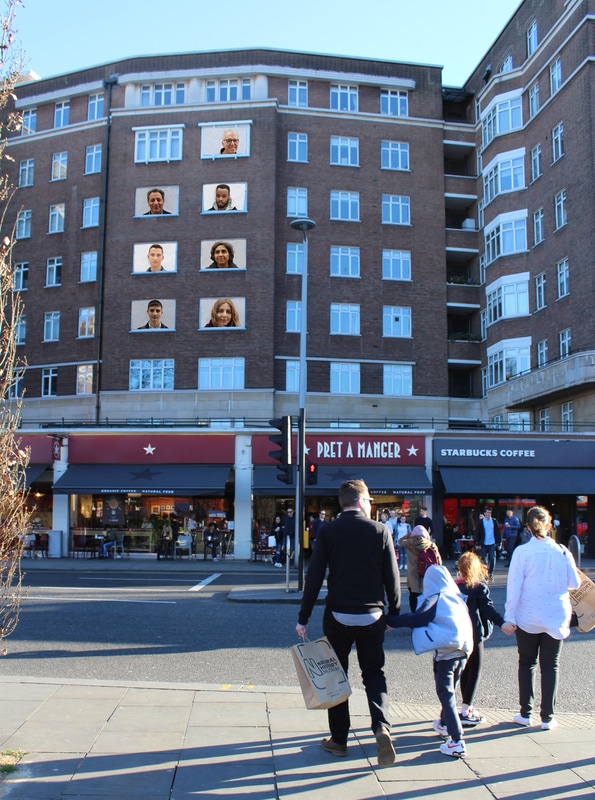
For this strand I was thinking of exploring the idea of a social hierarchy. Our society has evolved a lot and with each generation it changes more however there is still a patriarch and a clear social hierarchy which prohibits many people achieving all they can in life. We live in a world full of labels and pre-conceded views on what people are like and social class is just another way in which our society thinks it should structure itself. For this strand I was thinking of taking photos of different social classes or groups and imposing these onto a building so that it looks as if the people themselves are the building. This would then imply that the lower classes of society are the foundations of the building and therefore "holding up" the rest of society. This would also show that not what everyone thinks of when someone says "lower class" or "upper class" is actually what they look like.
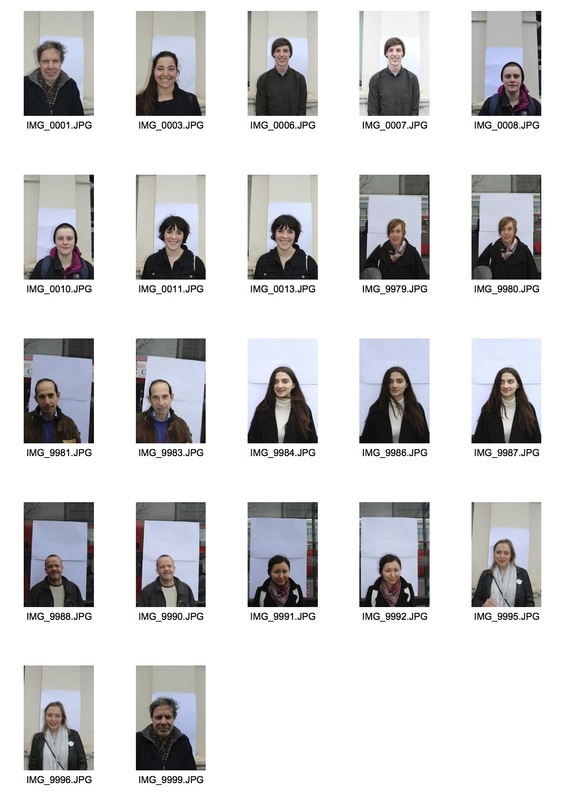
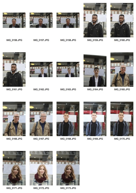
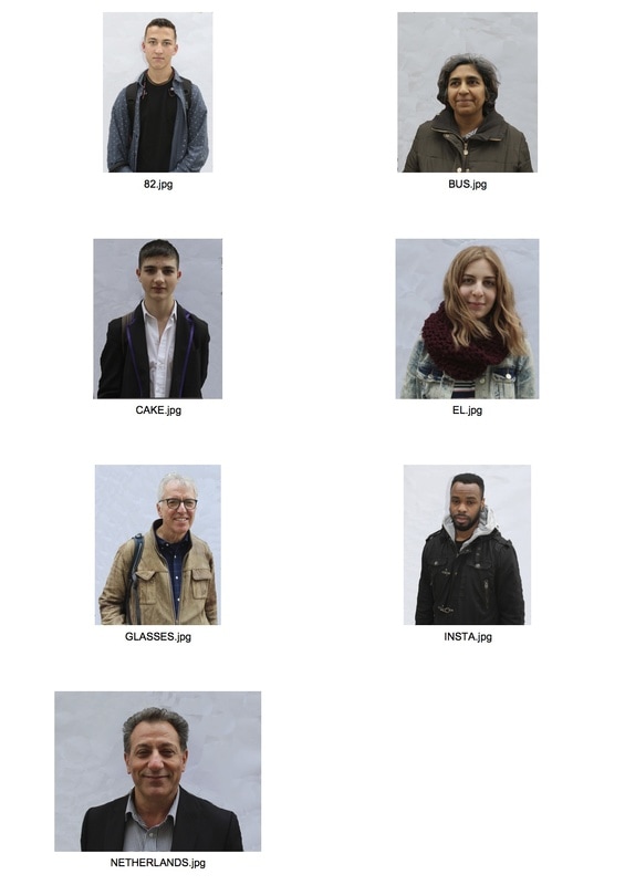
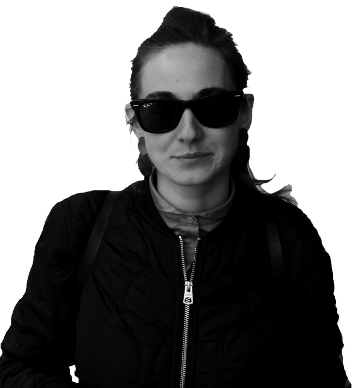
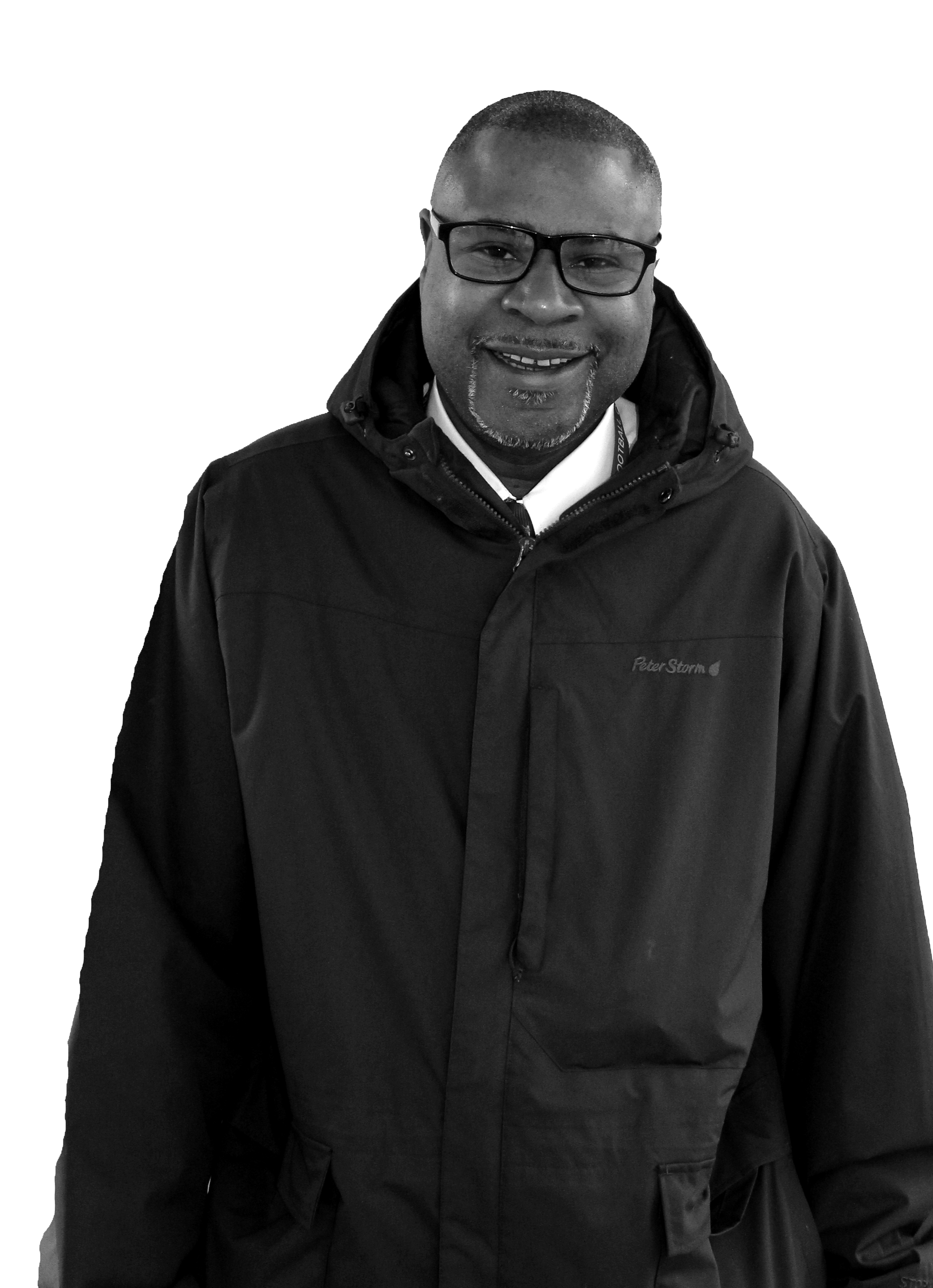
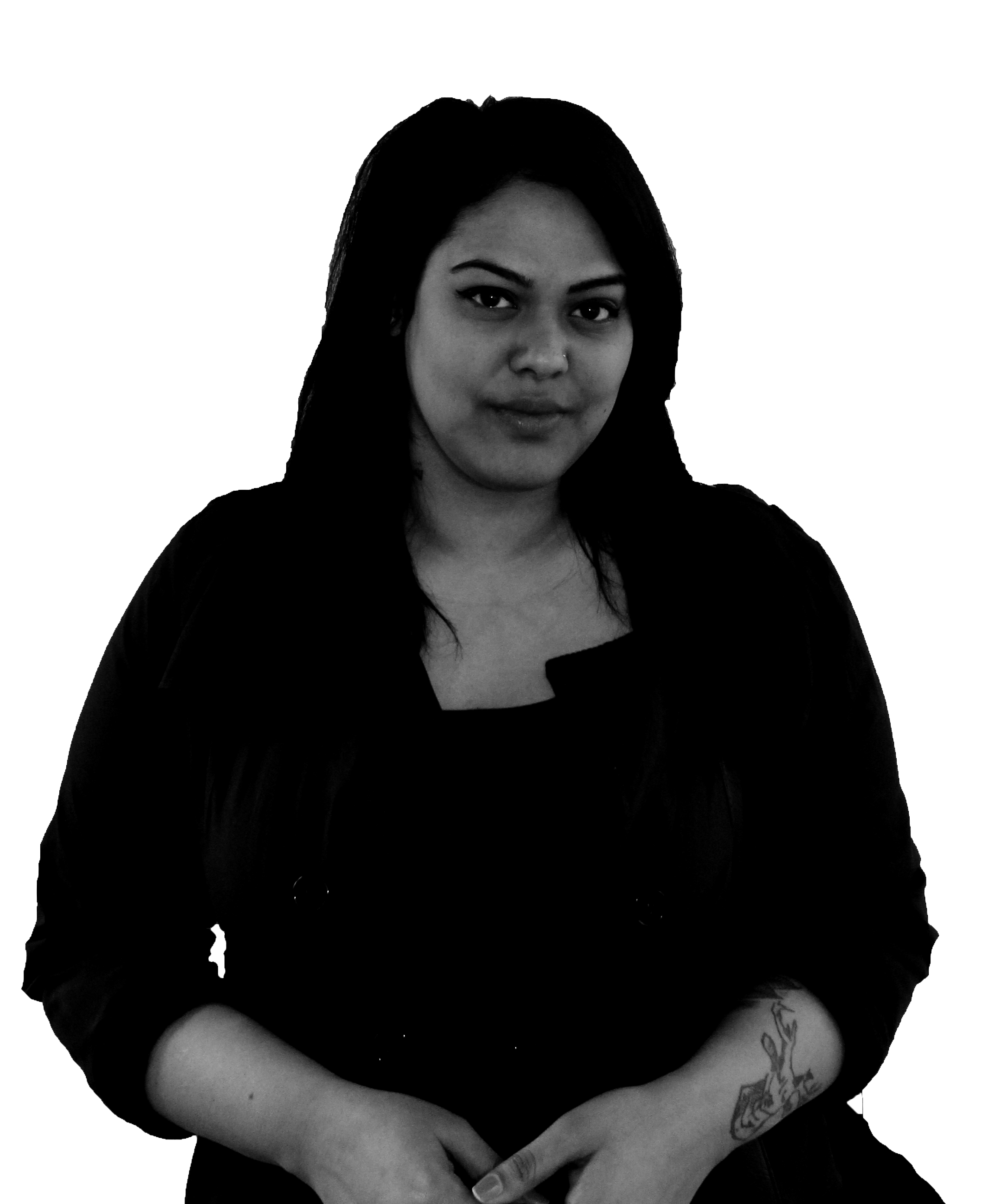
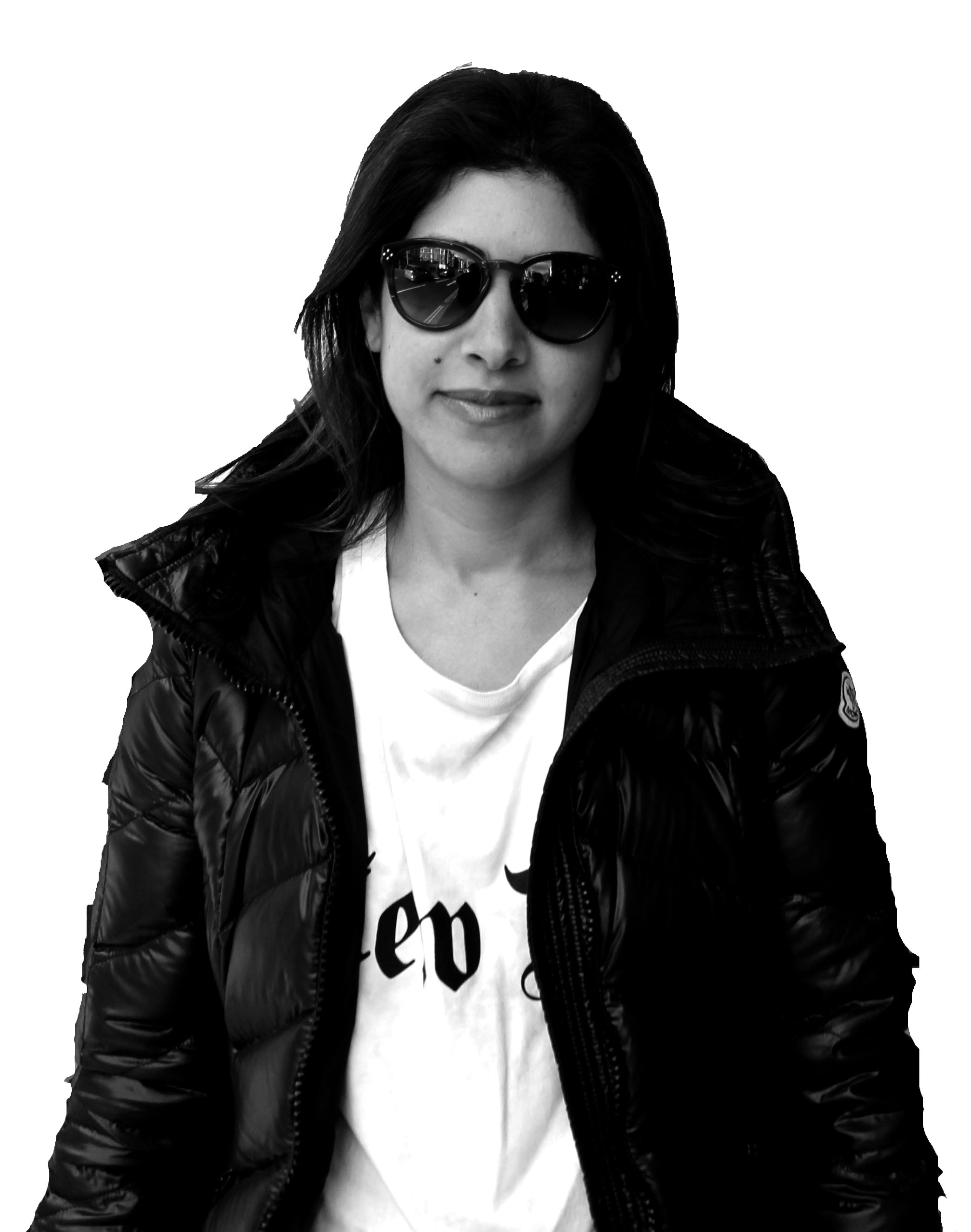
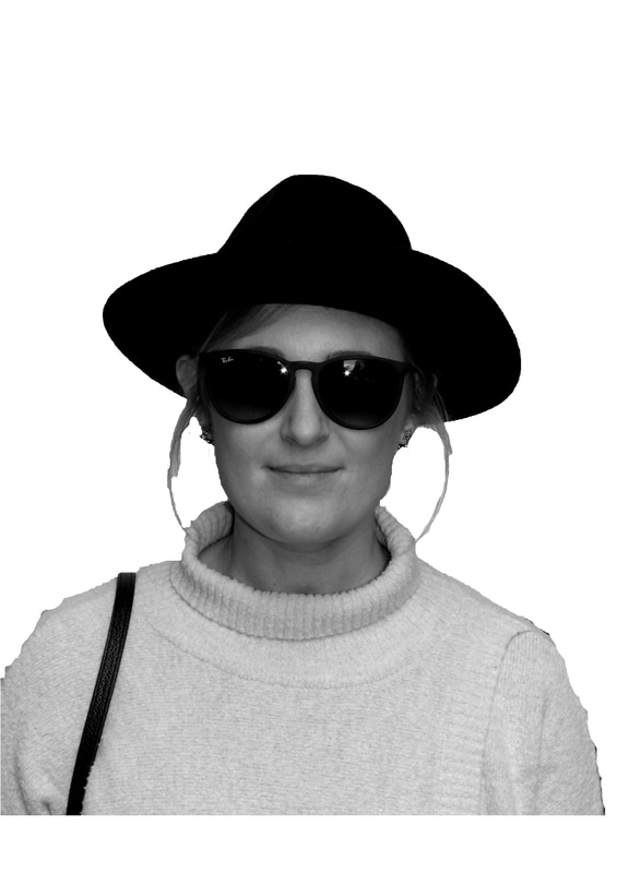
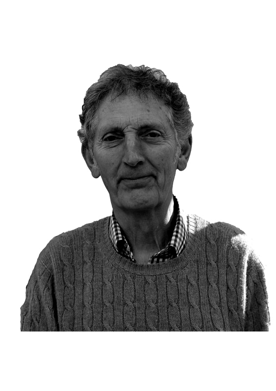
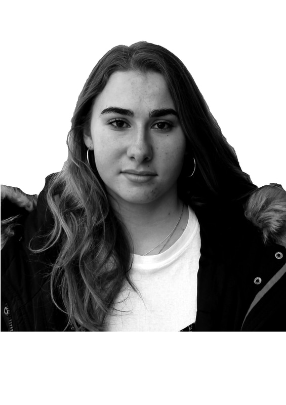
To take photos of people I went to Archway first and then up to Highgate so that I could get a contrast of people. I took two big pieces of white paper and stuck them onto a wall or a bus shelter and asked the people who I took photos to stand up against that to apply a studio type feeling to the photos.
Instead of asking different people who appeared to me to be either lower, working, middle or upper class as I thought this would be quite stereotypical and in a way defeats the point I'm trying to get across, I asked the people I took photos of which socia class they identify themselves with. This was interesting as most people defined themselves as either middle or working class however there were two people who gave interesting responses. One person didn't want to define themselves as a class and said they're "just me" and the second person didn't know which one to pick as they didn't think that classes should/do exist.
Instead of asking different people who appeared to me to be either lower, working, middle or upper class as I thought this would be quite stereotypical and in a way defeats the point I'm trying to get across, I asked the people I took photos of which socia class they identify themselves with. This was interesting as most people defined themselves as either middle or working class however there were two people who gave interesting responses. One person didn't want to define themselves as a class and said they're "just me" and the second person didn't know which one to pick as they didn't think that classes should/do exist.
Edits: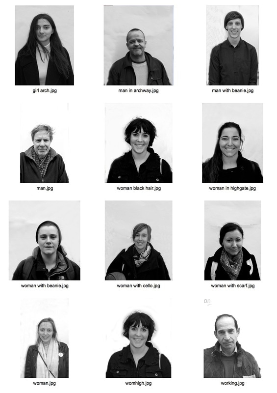
|
|
I then edited these photos onto windows of a council flat to clearly exhibit the idea of a social hierarchy. I placed the people who viewed themselves as working class at the ground floor windows, the people who identified as middle class on the middle floor and the people who viewed themselves as upper at the top floor of the flat.
Strand 3: Structure of the body
|
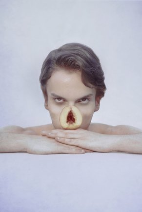
Marwane Pallas
Marwane Pallas is a French artist who is famous for his photography of self-portraits. One of Pallas' project develops an idea that was around in the medieval period. One important aspect in folk medicine was associated with herbalists and wise women. This created the belief that natural objects which looked like a part of the body could cure diseases that would occur in those parts. This has led Pallas' to photograph portraits and either place in front or photoshop on top a fruit/natural object which appears to look like that part of the body. 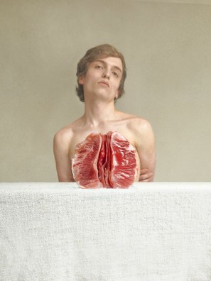
|
|
For my final strand I wanted to develop the task we did in class of revealing the bones and muscles which are under the skin of humans. However, instead of doing it simply with the bones and muscles of a human which are actually there I thought I could replace it with something else. This really makes you think about what would be there instead and makes you realise the intricate structures of a human body which you see everyday however don't always notice every detail.
This is similar to Pallas' work as he replaces and blocks certain parts of the body with fruit so that all you can see is the fruit which has a similar shape to that body part.
This is similar to Pallas' work as he replaces and blocks certain parts of the body with fruit so that all you can see is the fruit which has a similar shape to that body part.
After looking at Pallas' work, I liked how his portraits were more casual than when taken in a studio. This was because there wasn't any harsh lighting and the model themselves looked much more natural. I wanted to reflect this in the portraits I took as I felt it would be much more effective if you could see the model felt comfortable. For this, I took a set of portraits in a very casual situation and then took a set of portraits in an environment which was more studio like however I got the model not to look directly at the camera and hold positions which you would on a normal day.
On top of this I'm going to take photos of inanimate objects which can resemble different parts of the human body which I can then edit on top so that the actual body parts are replaced. I think I'm going to use some fruits which look similar to body parts as these have more links to the human body than a lamp does however I think it will also be interesting to do it with objects that aren't linked to the body at all.
On top of this I'm going to take photos of inanimate objects which can resemble different parts of the human body which I can then edit on top so that the actual body parts are replaced. I think I'm going to use some fruits which look similar to body parts as these have more links to the human body than a lamp does however I think it will also be interesting to do it with objects that aren't linked to the body at all.
|
|
I then combined these two photos to highlight the structure of the models body by using the inanimate objects.
I didn't really like how these photos turned out. The editing of objects onto people didn't fit together as the shape of the peoples bodies and the shape of the objects weren't the same shape.
Chosen Strand: Structure of Society
The strand which I've chosen to develop is the structure of society. I've picked to develop this strand as I think there are many different aspects of the project which I can focus on and expand in order to turn it into a final piece.
David Crooks
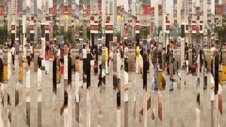
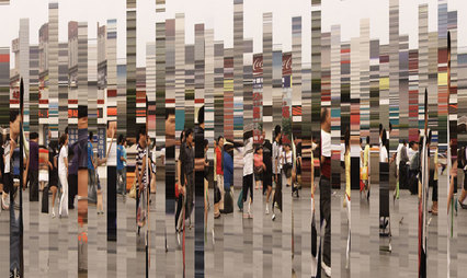
David Crooks is a new media artist and worked collaboratively with the Chartwell Collection to create a project called "Static No.16". In this project, Crooks has created a video where he captured urban life but has not only slowed down the video footage but has also sliced up the footage and combined it with another still image. This is repeated 4 times within a shot so when someone walks in front of the camera, they appear to walk across the shot 4 times. Below are some stills of the video he made which present an abstract view on an ordinary street view.
David Crooks is a new media artist and worked collaboratively with the Chartwell Collection to create a project called "Static No.16". In this project, Crooks has created a video where he captured urban life but has not only slowed down the video footage but has also sliced up the footage and combined it with another still image. This is repeated 4 times within a shot so when someone walks in front of the camera, they appear to walk across the shot 4 times. Below are some stills of the video he made which present an abstract view on an ordinary street view.
|
|
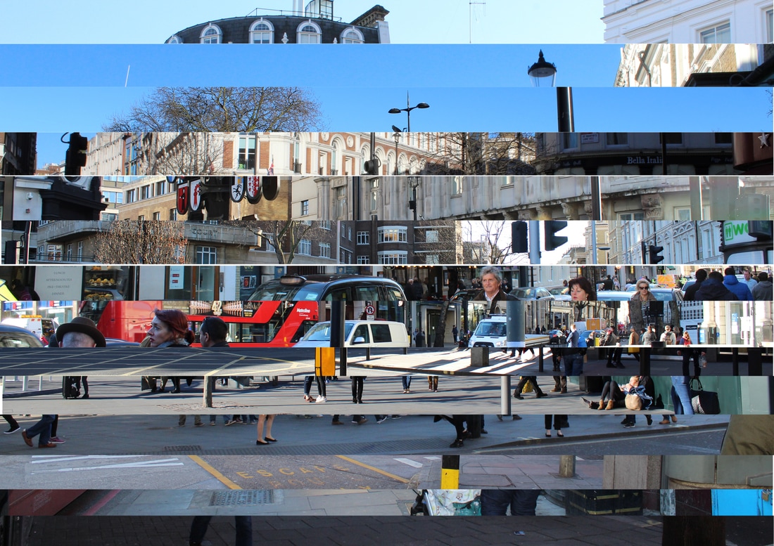
Development 1-Strips of images
For this development, I'm going to travel around different parts of London which are all differently socially developed and take photos of the streets. In all of these photos there is always going to be a common object in the same part of the photo such as a telephone box in the lower right hand corner. Once I've taken all of these photos, simialr to what Crooks did I'm going to cut them horizontally so that one photo of a landscape is created from lots of different strips of different locations. This means that by including the same object in each of the photos, once they are all cut and placed together, there will be one constant thing amongst this landscape.
By building it up horizontally instead of vertically like Crooks did, it reflects the social hierarchy which I'm trying to replicate by going to different locations which have developed socially different amounts.
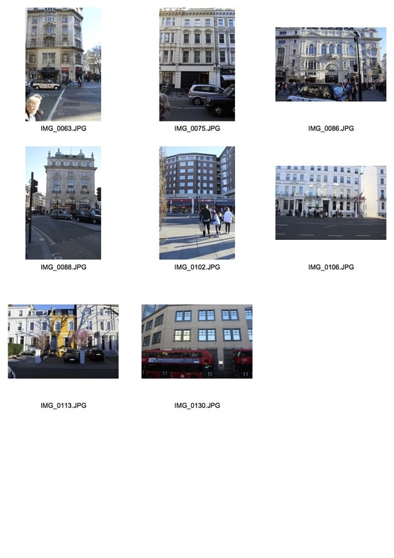
To take these photos I went on the tube and started at Kings Cross and then took the Piccadilly line to various different stations. This was good as I was able to get a range of places which were kind of close together which was also good as it shows not only how diverse London but also how, even if the locations are right next to each other, they can exhibit completely different social development.
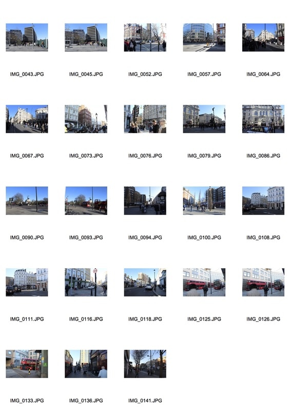
From these photos, firstly I picked 14 photos which I thought portrayed differently socially developed locations. When I took these photos I always made it so that there was a lamp post in the right of the image every time. This was hard though as in each different places there were different amounts of people and I was always at different distances from the lamp post so when I tried to match these up it was quite challenging.
|
This was the first collage of photos I made with layering all the different locations. In this one I included all of the locations I photographed which was 14 different places. I layered them so that more lower/working class areas such as holloway were at the bottom and then in the middle there was more middle class areas such as Piccadilly Circus and Leicester Square and at the top was a more upper class area such as South Kennsignton.
When putting these photos together I wasn't able to match up all the lamp posts which occured in each of the photos as they werein different spaces and they didn't collaborate with the other lamp posts. This meant that the overall effect was that the collage looked very busy and not very much like an overall place at all. |
|
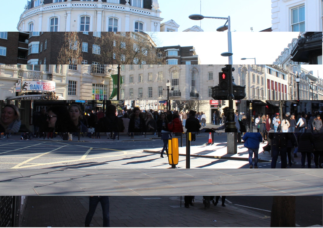
This was the second collage I made. As the first one I had made looked too busy, the way I thought to reduce the busyness was to reduce the amount of images I use to make the collage. I decided to reduce the amount of images I included by half so only included 7.
This resulted in a much better overall collage as you could still see a range of locations and as there were less I was able to match up the different lampposts so that there was one solid thing in all of the photos. This meant that the overall collage looked much less busy. However, the lamp posts were made up of lamp posts colours so it wasn't that constant. |
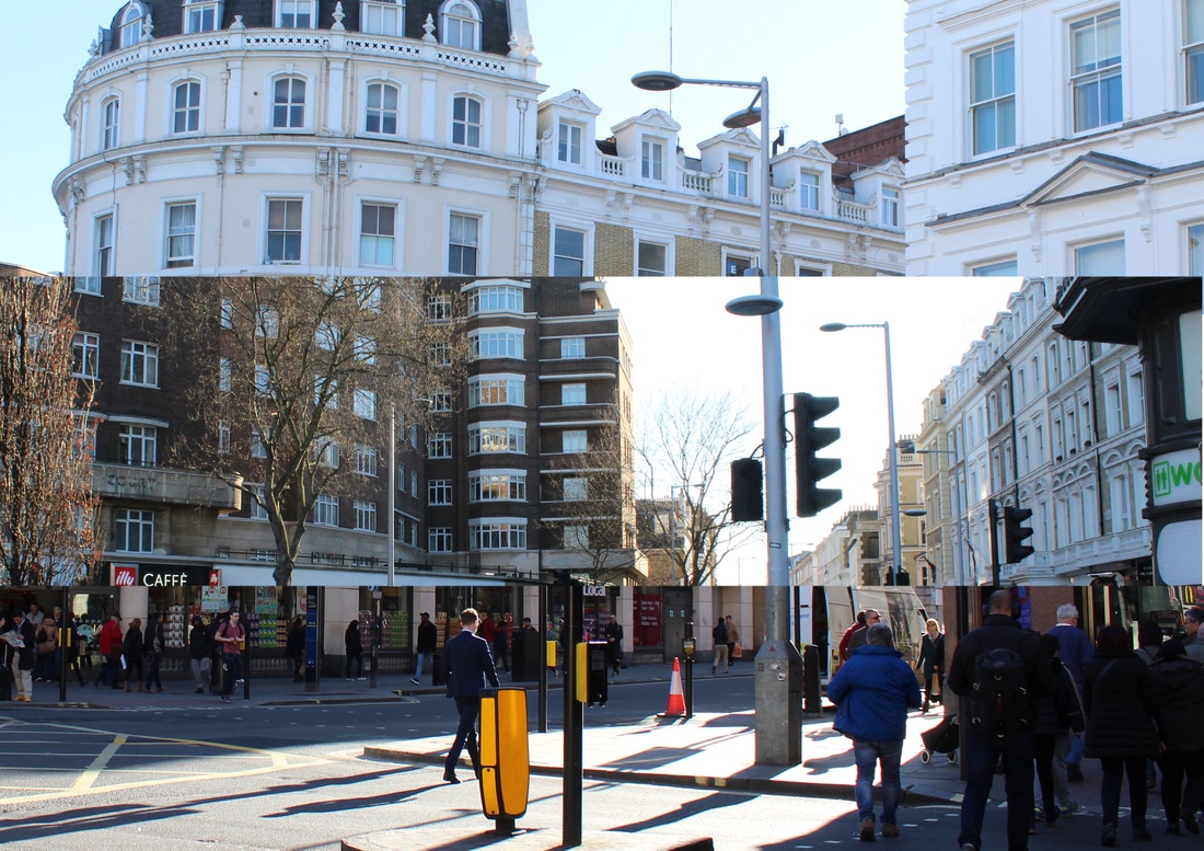
|
This was the final collage I made as even though the one with 7 images wasn't too busy it didn't work as well as I wanted as the colour of the lamp posts were all different colours. In this collage I used three different images from (in descending order); South Kensington, Leicester Square and Piccadilly Circus.
In my opinion this image worked the best out of all three as it's very clear what the constant image is and its quite clear to see the difference between the three different locations. However, I think it doesn't show enough variety and therefore either I would include one or two more images (with the same coloured lamp post) or I make sure that the three different locations which I photograph show massive changes rather than subtle ones. |
John Clang
John Clang is a visual artist who works in photography and film. He was born in Singapore and then received his Master of Art Fine Arts from LASALLE College of the Arts. Most of the work which Clang produces is based upon the idea of time, displacement and existence as this is what he's fascinated by. His work doesn't necessarily exhibit a documentary style image of the world around him but something from a man's imagination.
One of his projects which is part of 'PEOPLEone' is called "Hopenhagen" experiments with lots of different ways to present portraits in an interesting way. One way he does this is by creating one portrait from lots of different faces. He doesn't combine these portraits electronically but manually prints them out and then rips different sizes of the different images and combines them.
|
|
|
|
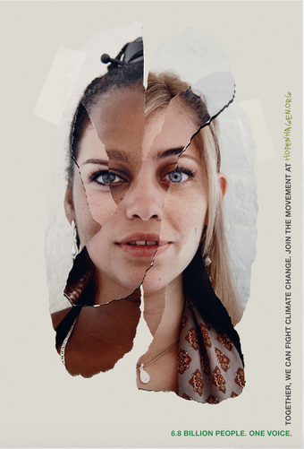
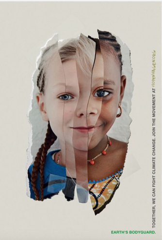
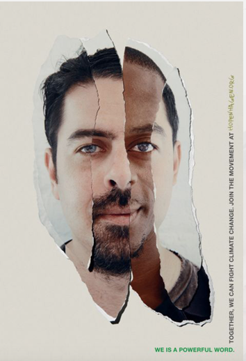
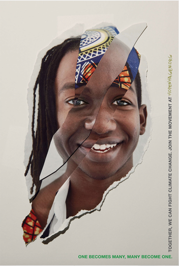
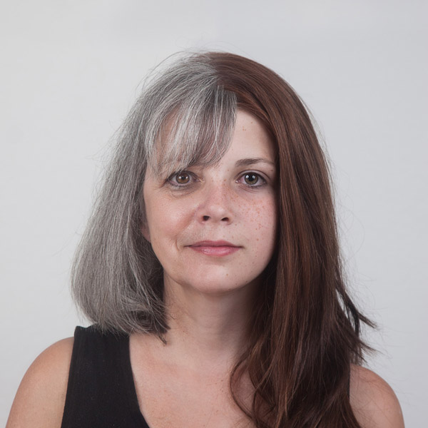
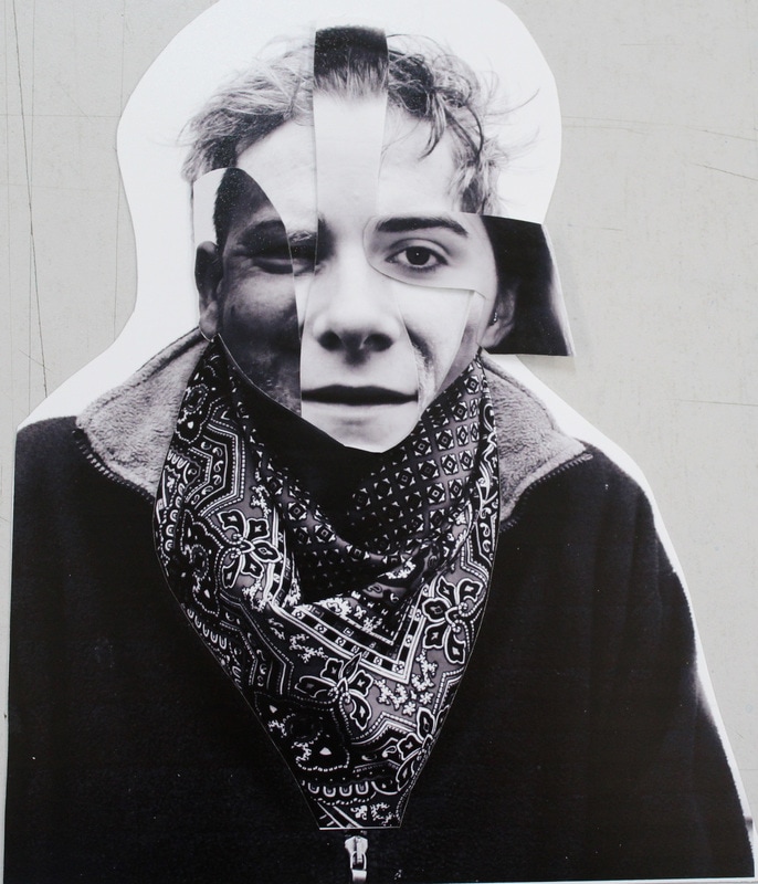
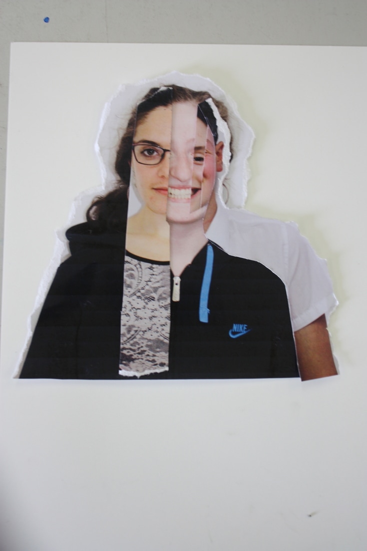
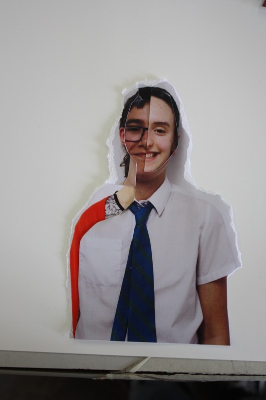
Ulric Collette
Ulric Collette is both a designer and a graphic designer as well as a photographer who lives Quebec City. In his project called "Genetic Portraits" he combines portraits of people who are in the same family, mostly siblings or parents and children but sometimes combines portraits of people who are cousins who only share 25% of genetics with each other. He splits each of the portraits in half and then combines them so that it looks like one face. In most situations the faces seem normal and something seems off about the faces however with some you can really see the differences between the two people. This project question the basic things about our identity like who are we? Where do we come from? To what points do members of the same family resemble each other, or are they so different? What is the part of genetics or of the soul in the physical appearance of a person?
Ulric Collette is both a designer and a graphic designer as well as a photographer who lives Quebec City. In his project called "Genetic Portraits" he combines portraits of people who are in the same family, mostly siblings or parents and children but sometimes combines portraits of people who are cousins who only share 25% of genetics with each other. He splits each of the portraits in half and then combines them so that it looks like one face. In most situations the faces seem normal and something seems off about the faces however with some you can really see the differences between the two people. This project question the basic things about our identity like who are we? Where do we come from? To what points do members of the same family resemble each other, or are they so different? What is the part of genetics or of the soul in the physical appearance of a person?
Similar to what I did with the different locations is I'm thinking of combining portraits of different people from different social classes together so that they create one portrait. One way I'm thinking of doing this is again by building up different layers so that the portrait is quite block and you can clearly see the different layers which resemble the social hierarchy.
A second way I was thinking of doing this was similar to what John Clang has done which makes the face look much more together and resembles the idea that even though there may be a slight distinction of different classes in our current society, it's not something which defines us and therefore we are all much more similar to each other than we think. By doing it with different sized strips it allows the portrait to merge much easier showing the common ground we all have.
A second way I was thinking of doing this was similar to what John Clang has done which makes the face look much more together and resembles the idea that even though there may be a slight distinction of different classes in our current society, it's not something which defines us and therefore we are all much more similar to each other than we think. By doing it with different sized strips it allows the portrait to merge much easier showing the common ground we all have.
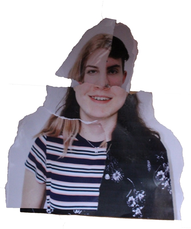
In response to John Clang's work, I took the portraits which I took earlier of people from different social classes and printed them out. I then chose to use one of the portraits as the base of all the images. I then picked different parts of the different images and built them on top of each other to create one portrait.
The second time I didn't have one portrait as the bas I just made all the different parts join together on a white background.
The second time I didn't have one portrait as the bas I just made all the different parts join together on a white background.
I think out of the two collages which I created this one worked better. This is because there was a base person so that if the cut up faces didn't match exactly there was still someone else's face underneath. Also, the range of people used was very diverse, not only in the different social classes but also in how they appeared and what they wore. This makes it more of a juxtaposition when they're put together.
|
This one didn't work as well, mainly because there was no base person underneath just a plain piece of white paper. This meant that when the cut out pieces didn't exactly match the portrait was obstructed by white which ruined the effect of it being one face made of many.
What did work well with this one however was the different pieces of the different faces which I used. By using the hair ad body of the same person it meant that I just had to slot in the different aspects of the faces into the shape there. This made it easier and also made the whole face seem more connected as there was one constant thing throughout the whole portrait. |
I think the fact that these images were black and white when I printed them out strongly affects the merging of the images. As they were black and white there was no colour contrast in their clothes and no bright thing for the audience to really catch their eye on which makes the whole image seem quite flat.
Also, in order to mix and match the faces I cut them up into different shapes. In Clang's work he sometimes rips them so that you can see the rough edges of the ripped paper. I think this exemplifies how the portraits have been put together manually and it's also nice that the images aren't perfectly cut so I also might try this when creating the images again.
Also, in order to mix and match the faces I cut them up into different shapes. In Clang's work he sometimes rips them so that you can see the rough edges of the ripped paper. I think this exemplifies how the portraits have been put together manually and it's also nice that the images aren't perfectly cut so I also might try this when creating the images again.
Development 2- Imposing onto buildings
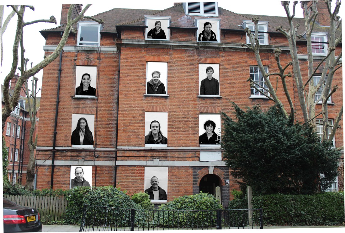
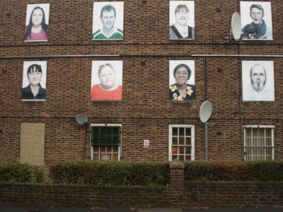
Hackney housing project
In 2012, an article was created which takes about the community in Hackney and how Hackney, as a place, is somewhere which experiences a lot of dramatic changes brought by the age of triumphant neo-liberalism to London and British society. Despite the fact we live in a city which has a symbol of conspicuous wealth, Hackney is in the middle of it and is a town which is the most deprived within the whole of London. Almost every ward within Hackney is amongst the 10% most deprived in the country and almost half its children live in low income households. However, this doesn't mean that Hackney is not recognise for it's culture which is exemplified by the dynamic and successful community.
Within this article, there is a project which took place in a council house which was going to be made to have a different purpose. The building of Haggeston West and Kingsland estates was meant to have refurbishment however, the council in Hackney decided that this wasn't economically beneficial. This was decided to be developed int extra homes, which would be sold and social houses passed to a Housing Association. one criticism that the council had with these flats were that the community within them wasn't diverse enough. So the project which the new residents created was placing portraits of the old community within the windows of the council flat. This exemplifies the differences within the community and shows how diverse this community actually was.
This development is working on my original idea however instead of mixing all different social classes on one type of building, I'm going to juxtapose the people and the buildings. For this, I'm going to take photos of a range of people from different social classes and of different buildings from different social classes. I'm then going to stick the portraits of the people from the lower social classes in the windows of the buildings from high social classes vice versa fro the people from high social classes. This links to the housing project which occurred in Hackney as it shows very clearly the differences between all of the portraits as your eyes are drawn to the portraits within the windows as this is not hat you expect to see in the buildings.
|
|
Edits:
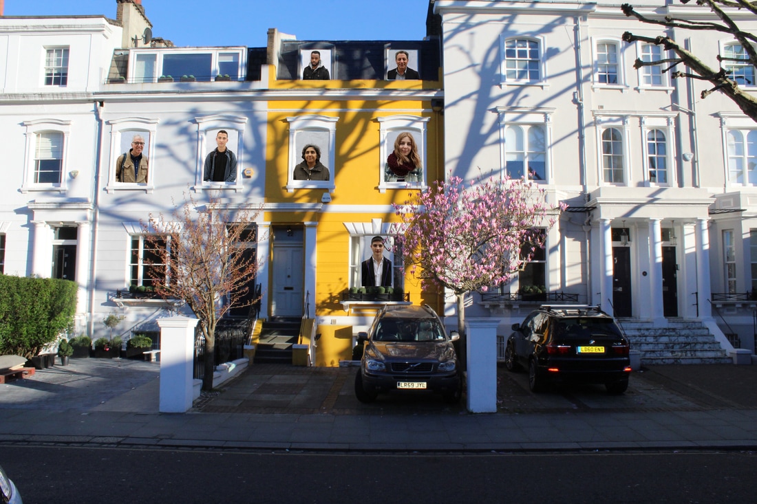
I think when I put the faces on the house it worked better than when I put them on the block of flats. I think this is because the shape of windows in the block of flats meant that I could only use a small bit of the portraits so I don't think it was effective.
Also, this time I used colour portraits rather than turning them black and white. I think this was also effective with the house as the house itself was very colourful so the portraits looked more natural when they were there. |
This version of portraits imposed on buildings looks very similar to what JR does which is the original artist I am responding to. This is because even though the portraits aren't on the actual building it looks as if the portraits are part of normal life as there are people walking on the street.
|
Final Developments:
Over the easter holidays I went to several different locations in London and took three sets of photos; people, landscapes and buildings. I wanted to go to six different socially developed areas of London so that I could see the contrast, if any, of people and places. I researched which were the three 'richest' areas of London and which were the three 'poorest' areas of London. The three richest areas which came up were Kensington, Chelsea and Knightsbridge and the three poorest areas were Hackney, Tower Hamlets and Newham. However because of train disruptions I wasn't able to get to Hackney.
Kensington:
Chelsea:
Knightsbridge:
Newham:
Tower Hamlets:
Edits:
|
|
|
I think this combination of landscapes worked very well as there is the constant of the lamp post which is very clear. Also, there aren't too many locations so the image doesn't come across as too busy and the difference between the locations is very visible.
|
After looking at the photos I took over Easter I think the project which worked the most was the merging of peoples faces. Rather than doing this from people who all look a similar age and they're all from the same social class, I'm going to choose one portrait from each of the different locations I went to and combine these.
In order to combine these photos I think I'm going to make sure that they're all the same size as this was one issue I faced when trying to combine people's faces. I'm going to print these photos on A3 paper and cut them all in the same shape. This means that you will be able to mis-match all the different portraits and create your own hybrid person from each different location.
When I did this in black and white the portraits worked better together as there was less contrast however with colour you're able to see the different colours and different clothing which shows what different people wear in different areas.
Thought Development:
|
My first idea was to place images of different people from different social backgrounds onto buildings to highlight the structure of society.
My final idea was to combine both the idea of photographing people in different socially developed locations and combining different people's faces so that you can visibly see the different social developments portrayed through different people.
|
|
From this I thought of making a hierarchy of different locations which again are socially developed in different ways. This was much clearer in showing the difference between each location.
My next idea was combining different people's faces, in a way which shows how the images themselves have been ripped, of people who are from the same area and are of a similar age.
|
Final Piece
Below there are two or three portraits from each location. For all of these photos I have turned them black and white and I think even though the colour has been taken away you can still clearly see the type of clothing each person is wearing and as they will fit together better once they're black and white I think it works.


To practice how the images would look once they were combined, on photoshop I combined all the photos above, using a small strip of each image and I used one portrait as the based image. For some of the images you couldn't see the difference between each of the images however for others it was very obvious. I then turned this into a GIF to show the progression from one person to many.
I think this went well and the portraits do fit together well however I would rather cut the portraits into different shapes other than strips as this can be used to highlight different facial features and makes it fit together better rather than looking very choppy. Also, as this was made up of 12 different portraits it looks very busy so I think next time I'll only use a maximum of 7-10 different people.
I think this went well and the portraits do fit together well however I would rather cut the portraits into different shapes other than strips as this can be used to highlight different facial features and makes it fit together better rather than looking very choppy. Also, as this was made up of 12 different portraits it looks very busy so I think next time I'll only use a maximum of 7-10 different people.
I think this GIF worked well however there were two many people so I had to add two horizontal strips which don't really fit with the rest of the GIF.
|
This was the second one I made so I tried making it with less people and making it all horizontal. However, for this one I think I used too few people and I think it was more effective when it went in vertical strips.
|
Out of these two GIF's I think the first one worked better. This is because I used thin strips so it looked overall like one person where as the second seems to be missing something. From this I know that I need to use 8 people and make the strips quite thin. After creating these two I tried making a GIF where the portraits weren't cut in strips but in sections as his is how I think I'm going to cut the images out overall.
I think this GIF worked very well and exemplify a range of different people which is shown not only through their expressions but through their clothing as well. Some of the portraits in his didn't completely fit together however I think this is fine as it shows how each different social class differentiates from each other.
However cutting it this way makes it very busy so I think I need to use less people to make it a clearer person. In this GIF I used 8 people however I think I'm going to use one person from each location so that there is a diversity within the collage and there are only 5 people per photo so it doesn't look that busy.
However cutting it this way makes it very busy so I think I need to use less people to make it a clearer person. In this GIF I used 8 people however I think I'm going to use one person from each location so that there is a diversity within the collage and there are only 5 people per photo so it doesn't look that busy.
I then combined 5 photos, one from each location to make six sets of photos. The way that I grouped these photos together was seeing which ones contrasted the most from each other. I wanted to make sure that in each set I had a range of ages, race and clothing (i.e. sunglasses). I then combined them and created a GIF like I have above, by using areas of each portrait not strips.
I think parts of this one work however not all of the photos git together well. This is because of the way that the people faced the camera when I took the photo.
I don't think this one worked very well because you can't really see the difference clearly and if you properly try and look it just looks busy.
|
Because of the differing amounts of the person that there is in each of the this combination looks quite choppy.
Despite the fact that these portraits don't completely fit well together I think this is another one of the ones that worked the best because it's not that busy and you can see the difference between each of the portraits.
|
I think this combination is one of the ones which worked the best an I think this is because I used very small pieces of each portrait.

I think this one also worked well as there's a range of ages used and the portraits kind of fit together.
|
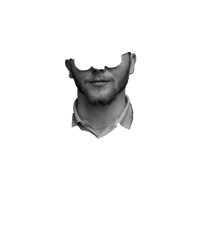
From these 30 portraits I have narrowed it down to a few people from each location based on which portraits were easy and looked effective once combined.
Newham:

Tower Hamlets:

Knightsbridge:


South Kensington:


Chelsea:


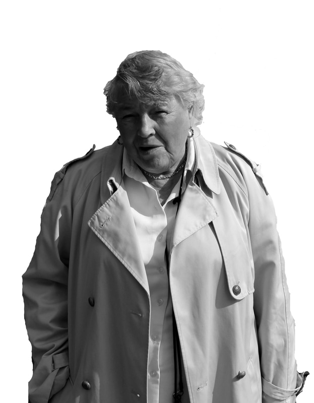
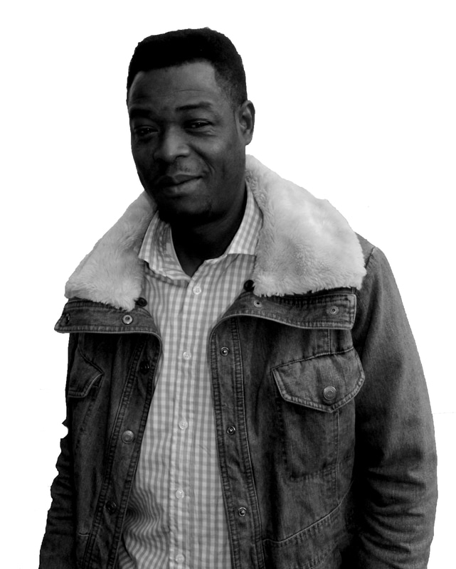
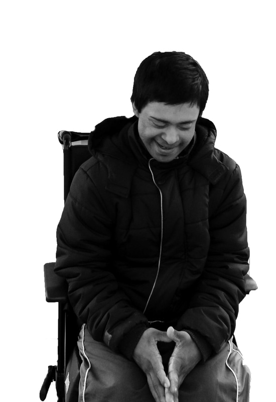
From these 19 portraits I narrowed it down further to these 5:


On photoshop, I then edited the 5 portraits so that they were all the same size which means that when I print them out they will all fit together. Because of the position of the 5 different people and how they all have a different posture and way of holding themselves up, when I try and combine them all, they won't completely fit together.
To overcome this problem I cropped the images so that it's mainly just their faces in the portrait however it still has a bit of the photo included below the shoulder. Also, as I want to print them onto A3 pieces of paper, I edited the images so that they are all the size of an A3 piece of paper.
To overcome this problem I cropped the images so that it's mainly just their faces in the portrait however it still has a bit of the photo included below the shoulder. Also, as I want to print them onto A3 pieces of paper, I edited the images so that they are all the size of an A3 piece of paper.
One of the most effective combinations I made above was one where I mostly just combined the faces. This was because I used smaller pieces so they fit together better however the contrast was still visible. Because of this, I edited the photos so that it's mainly just the people's faces and a bit of their clothing. This means that I will be able to cut the wood into smaller, simpler pieces however you are still able to see the clothes which the people wear.
Three of the people which I chose are looking straight at the camera while two aren't. I think it's okay that they're not as when most of the portraits fit together, excluding two or three, it was quite effective. Also, I might amplify this juxtaposition by using two different pieces of wood for the jigsaw puzzle which have two different thickness'. This will create more contrast so the fact that two of the portraits aren't looking at the camera is okay.
Three of the people which I chose are looking straight at the camera while two aren't. I think it's okay that they're not as when most of the portraits fit together, excluding two or three, it was quite effective. Also, I might amplify this juxtaposition by using two different pieces of wood for the jigsaw puzzle which have two different thickness'. This will create more contrast so the fact that two of the portraits aren't looking at the camera is okay.
|
After my photos were printed onto A3 paper, I created a template on an A3 sheet of paper which I made according to the portraits. I was then going to stick this template to 5 different pieces of wood which were all pre-cut to an A3 size. However, when I tried cutting the wood with a saw it didn't go exactly right which meant that each different portrait would fit with itself however when put with the other portraits they wouldn't have fit together. I then transferred the template which I drew not the computer on a program called '2D design' which is used for laser cutting. To make sure that the template I was dating online wasn't just done by eye and would fit with my portraits I measured the length and width of each curve and made the template online have the same measurements.
|
|
I then tried to cut a sample piece of wood out with the laser cutter however this made score marks on the pier of paper which wood be my photograph. To prevent this from happening I turned the wood over and flipped the template I made so that it would be cut accordingly. When this was cut, it didn't go all the way though which on the plus side meant that there were no scorch marks however it meant that the wood wasn't cut completely. I then cut the wood with the saw I tried using originally however this time it was easier as half of it was already cut by the laser cutter. However, because I had spray mounted the photos onto the wood already, when they were cut with the saw the edges frayed. I sanded down the edges so that they were smooth and then they all fit together.


